I recently came across an interesting summary table on median condo prices in the Great Boston area (re-created in Excel below; original data from the Boston Magazine, whose link is here)
Median prices probably are probably a good measure instead of averages because they might be skewed by very expensive high-end buildings. Nevertheless I was curious to see over the past 10 years how much appreciation has happened to each town, so I did a PivotTable to show the distribution of 10-year appreciation across all towns in the Greater Boston area.
It surprised me. Here is the picture:
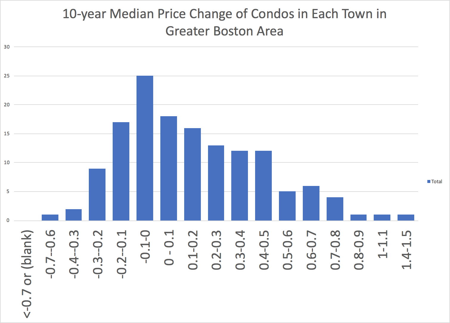
What surprised me is that the mode of the histogram – i.e., the highest bar – is one that show not increase, but decrease, of between -10% and zero percent, in median prices over the ten years.
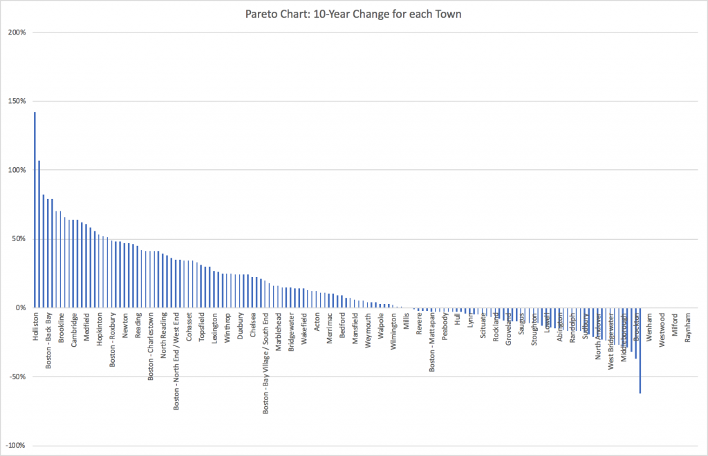
Here is a pareto chart showing 10-year change for each town:
Several observations here:
- We need to be aware of sample size. For example, Holliston shows the most gain with whopping ten-year change of 142%. What is going on? I am not sure, but I suspect that town may have a smaller number of condos compared to other towns. When you have a smaller sample, its median can be quite variable. So we need data on number of condo built.
- More towns show gains than those with losses. In fact, across all towns, the average 10-year increase is 14.6%.
- Most neighborhood in the city experience increases – but not all. Mattapan and Hyde Park are the two neighborhoods that saw decrease.
This little data set is surprisingly interesting to look at. What is your insight?