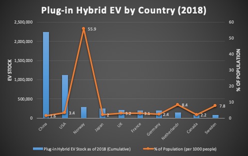
When two columns of data are of different scale, you will need to use a combo chart to plot each column on a separate axis.
In the video below, one column is numbers of Plug-in Hybrid Electric Vehicle (PHEV) by country, while the other column is percentage values normalized by country population. As you can see, plot both on a common axis will result in the percentage values too small to see.
Combo chart is the perfect solution for this.
You can download the Excel file here.
On a PC, the steps are essentially the same, although the interface is a little different.
One final note, you do need spend time to add axis titles to each to let readers understand what each axis represents. Adding data labels is also a good idea. Finally, do not forget to give it a meaningful title.