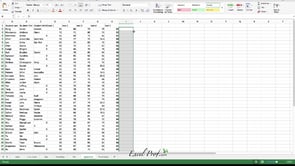
In many cases, you need to generate a series of graphs using Excel, and yet do not want to put them into one single picture. For example, you would like to draw the price movement of each of 10 individual stock. As you can imagine, having 10 separate line charts in one worksheet will make the screen very crowded.
Excel has a very neat solution called Sparkline. Check it out:
What I like about Sparkline is that it makes the spreadsheet very neat, with no graphs floating around. Of course, it has its limitations. For example, it can not draw very advanced charts such as scattered plots. But when used properly, it can be extremely effective. In fact, almost every time I demonstrate this feature I can see sparkles in peoples’ eye going off and hear “Wow! Look at that!”
