
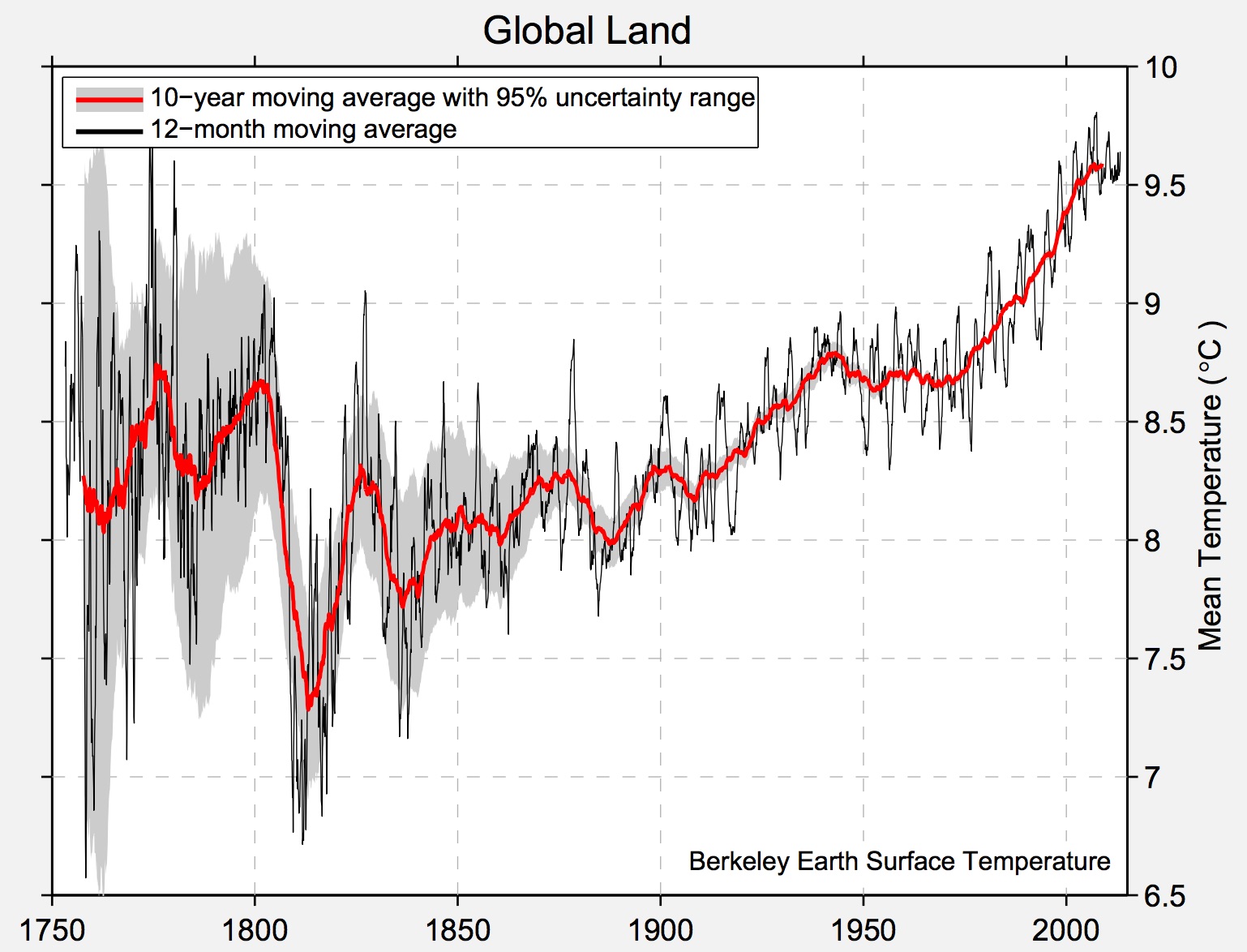
I have always been fascinated by climate data. Just today while researching for data on this topic, I came upon the Berkley Earth website and found that it has warehoused detailed climate data for the last 350 years! It has done quite some interesting analysis. For example, they have taken a long view on earth temperature by averaging over the past 10-years and generated the following graph on global land temperature since 1750:

Source: http://berkeleyearth.lbl.gov/auto/Regional/TAVG/Figures/global-land-TAVG-Trend.pdf
Seeing this graph again reminds me the power of data. I especially appreciate the fact the people started measuring weather in the 1700s (Although I very much wish we had begun 1000 years earlier! We would have known a lot more about the earth.) Note the greater uncertainty as depicted in the 1700s, as compared to the most recent centuries. It probably incorporate some measurement errors and smaller samples in those early years. But if one looks at the red line, the 10-year average, she should be sufficiently concerned at the upward trend.
I then looked at how temperature has changed over the past 350 years by downloading a small dataset and plotted the following:

There is a lot of averaging and other data aggregating details behind the graph, but the main takeaway is clear: We are living on a planet that is increasingly warming up for the foreseeable future.