Tag: google
-

Google Colab is an awesome Python programming tool for AI and data analysis
Picture credit: Microsoft Bing Co-Pilot Image Generator One of the problems associated with learning to code is that the initial hurdle of just getting your first line of code to run is pretty high. You need to get comfortable with a command-line driven interface. You need to install multiple packages depending on your particular needs,…
-
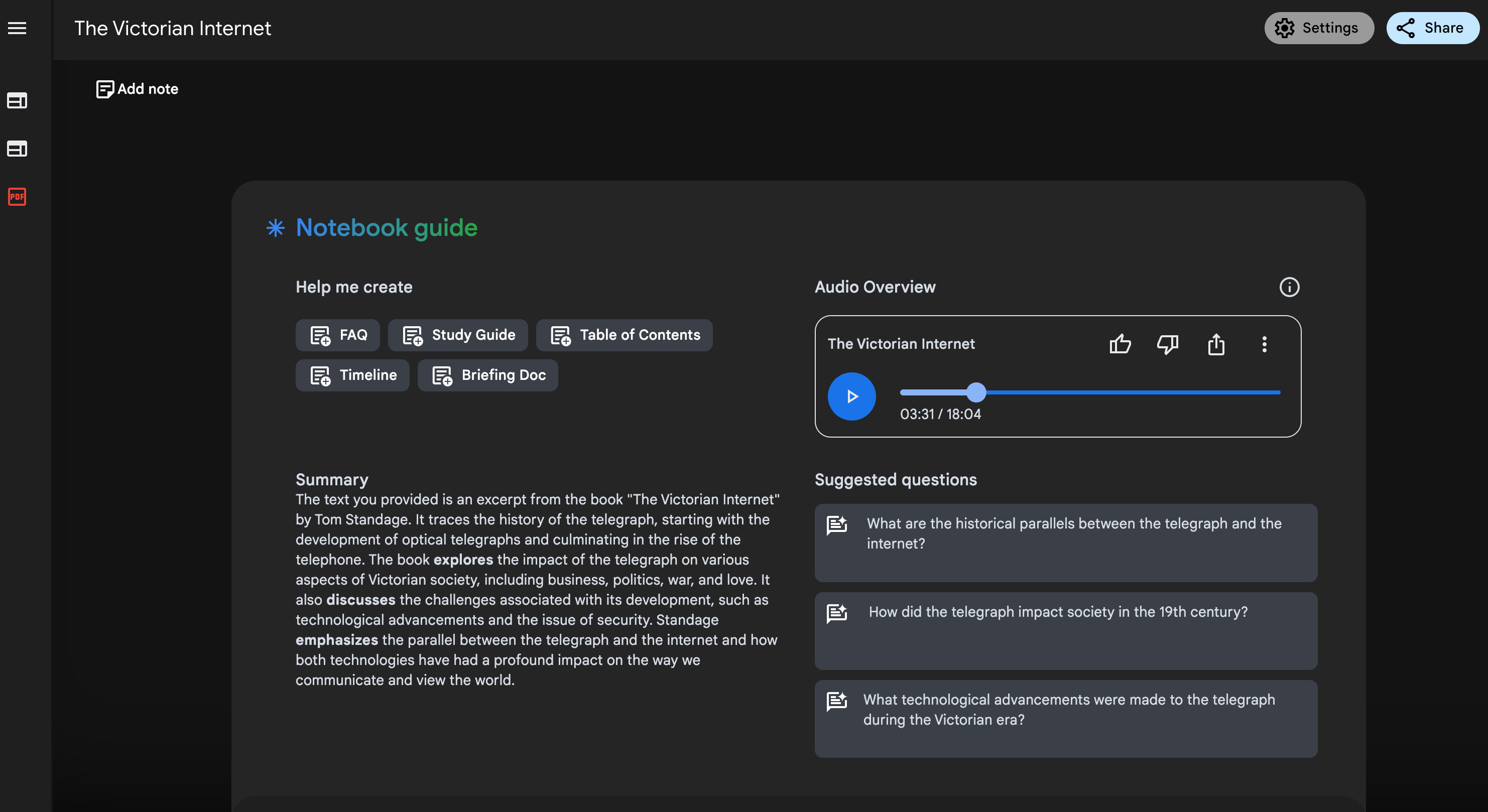
Google NotebookLM is a great tool
AI is all the rage lately. As a person of curiosity, I have found AI to be a very good assistant. It is not an ever reliable assistant, but it can do a lot of things human beings have difficulty to do. Google NotebookLM is such an example. I recently read a very interesting book…
-
Google Sheets is Catching up with Excel in Charting
Excel is still my number one choice when it comes to graphing and charting, or just first-cut exploring, but I have notice that Google Sheets is also becoming more and more capable in its charting department. Do you know Google Sheets have Pivot Table? Do you know that it has a motion chart that even…