Pareto chart, put simply, is a sorted frequency chart. It is used mainly for identifying the most frequent occurrences in a collected sample. Some business-situation questions can be answered by a Pareto chart include:
— What are the most common service duration in a process?
— Which aspect do our customers like best?
— What are the most common complaints?
Here is a quick tutorial on how to draw a Pareto chart:
In management, knowing what are the leading factors and causes are important because managerial resources are limited and therefore they need to be spent on addressing high-impact things.
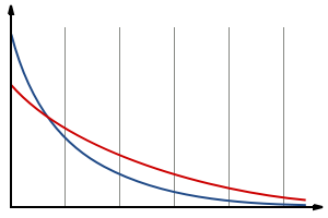
In contrast, we often hear the term “long-tail”:

(Source: https://en.wikipedia.org/wiki/Long_tail#/media/File:Longtail.svg)
In a long-tail situation, the statistical distribution becomes much flatter, indicating each item has more or less similar weight to each other. From a managerial decision perspective, this is not necessarily good news. It means there is no obvious priority to things – they are all important (or unimportant)!
