
A slight problem with drawing data on ranking is how we normally think about ranking.
We normally associate “#1” as the best, and “#10” as worse compared to “#1”. But Excel chart typically shows a bigger number in a higher vertical position, and a smaller number in a lower position, as is shown in the below example:
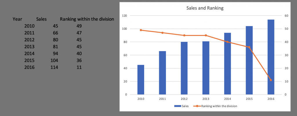
As you can see, the orange ranking line points down as the ranking gets better, which does not look very up-lifting. After all, normally we say “Climb up the ranking” as we get better, right?
So we need to fix it.
It is a simple fix, fortunately. You just need to select the right axis, and right-click. Choose “Format Axis”. Then find the option “Value in Reverse Order”. The resulting picture, after some beautification, is the following:
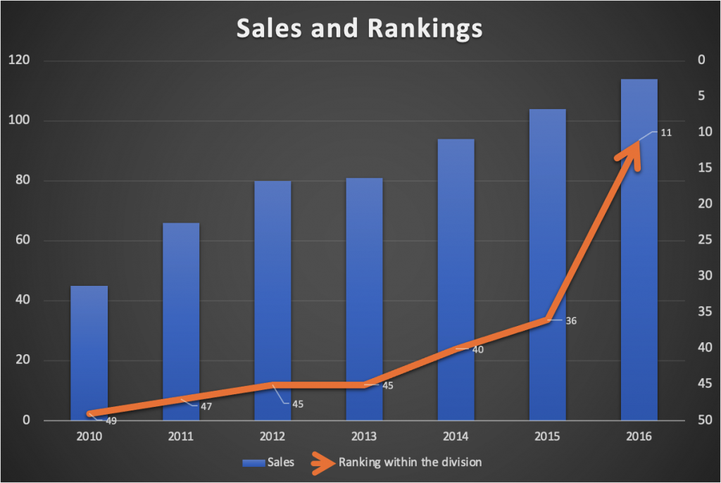
Now that is much better, wouldn’t you say?
You can watch my video illustration:
You can download the file here, and play with it yourself.
Leave a Reply
You must be logged in to post a comment.