In an earlier post, we discussed the difference between demand and sales using a simulation exercise. Now the question is: How can we visualize the difference?
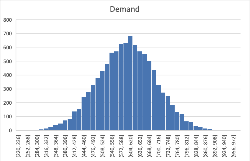
To start off, we all know the shape of the normal curve (in the example we discussed the mean is 600, and its standard deviation is 100):
However, if the inventory is set at 700, then the sales quantity is determined by the following:
Sales = Minimum (Demand, Order),
Which yields the following histogram:
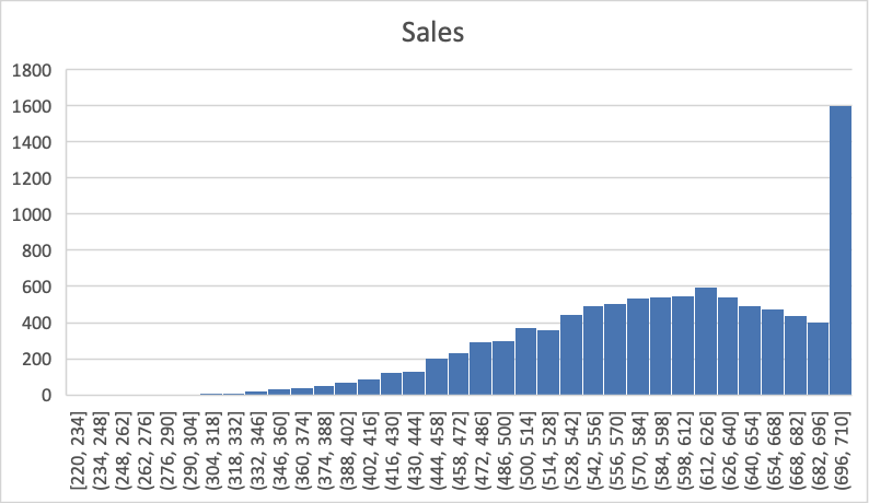
Does this remind you of some mystical animal? Yes, the Loch Ness Monster!
OK, kidding aside, why is there suddenly the long head and neck, while the rest seems to remain to be of the normal curve?
The answer is that precisely because of the order quantity, any sales is bounded from above by that. So the long neck is the probability mass of demand exceeding the order (and thus only selling that much)… Mystery solved!
Leave a Reply
You must be logged in to post a comment.