Tag: add-in
-
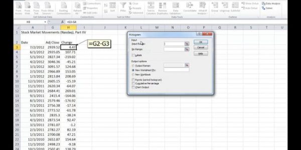
To build a frequency distribution chart, do NOT use Excel’s Histogram add-in tool
A histogram (also called a frequency distribution chart) shows how many times a specific value occurs within a certain range. It is super-useful if you want to know how a variable is statistically distributed. But Excel’s built-in histogram tool is not the best tool to use: It requires you to specific “bin values” before hand, which requires…