Tag: VOCID
-
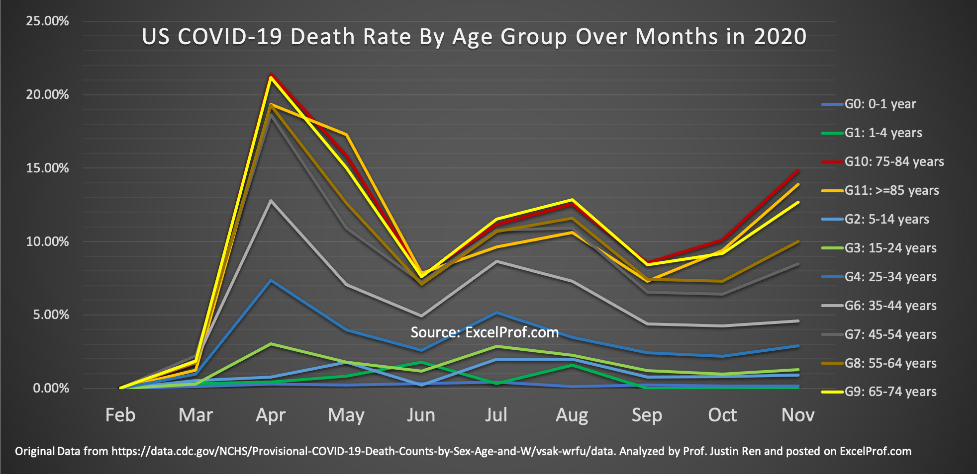
Why Hasn’t Anybody Done This Graph about COVID-19?
The COVID-19 pandemic has been going on for over 9 months now (I am writing this in mid-December of 2020). One question that I have always been thinking about: Has the risk of dying from COVID changed over time? In particular, have younger people become more risky of dying from contracting the virus? I have…