The COVID-19 pandemic has been going on for over 9 months now (I am writing this in mid-December of 2020). One question that I have always been thinking about: Has the risk of dying from COVID changed over time? In particular, have younger people become more risky of dying from contracting the virus?
I have learned that there are two main measures from such risk: Case Fatality Rate (CFR), which is the ratio of the number of deaths of a disease over the number of cases, and Infection Fatality Rate (IFR), which is the ratio of the number of deaths of a disease over the total number of people infected with the diseases. What I am interested, though, is neither. Instead, I would like to see proportion of deaths from COVID-19 among all deaths in a particular age group. That would give me a sense of how deadly the virus has been. The higher the proportion, the deadly the virus is.
I was looking for a good graph of such rates of COVID-19 in the US that (a) shows a time trend over the past months, and (b) breaks down by age groups. I did some Google search, but to my dismay I could not find a good infographic to fits the criteria (There are some good ones, I have to say. For example, if you are interested in country-level comparison, I recommend the one by OurWorldinData.org). Maybe I was not searching hard enough. But anyway I decided to take the matter into my own hands, and visualize that by myself.
First of all, we need the right data. It took me some time, but I finally found on CDC website.
However it was weekly data, and for my purpose monthly data would be better. So I used Excel to clean up a little. I also had to recalculate the mortality rate with the monthly death numbers. PivotTables to the rescue!
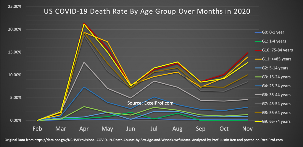
Finally, the graph that we have been waiting for:
What can be learned from this graph? Well, a few things:
(1) Children and young people have always been safe, relatively speaking. For example, infants (<1 years) death rates from COVID have never been over 0.5%. School-age children (5-14 years) never over 2%. On the other hand, senior citizens continue to be the highest risk group. We already knew that, so I will not repeat.
(2) The aforementioned Infection Fatality Rate (IFR) is very different from the rates graphed here. This is because there are many more people who have or had COVID but simply are not tested. There have been more and more medical studies that measure IFRs around the world. For example, in this study led by researchers in Cambridge University in the UK and that is published in Nature in November 2020, the median IFR in the US is estimated to be around 0.5%. Back in September 2020 a WebMD article puts the IFR rate in the US at 0.6%. To put these numbers in perspective, the IFR for seasonal flu is commonly agreed at 0.1%. And the overall death rate from seasonal flu and pneumonia is about 3% (among all deaths).
(3) Data are noisy. For example, February and March data are not to be trusted. Not only because the numbers are small, but also because there probably were not consistent protocols and processes in recording COVID-related deaths. There are concerns for incentives behind reporting as well, as the recent CARE Act stipulates that hospitals would receive 20% more payment if a patient is listed as a COVID patient (see the exact language from American Hospital Association here).
(4) Over time we get better in reducing COVID death rates. This is evidenced by the overall decreasing trend, although such a trend was being reversed since this past October, especially for senior citizens.
So What are the implications?
For one, I question the wisdom of economy-wide lockdown. As we saw in the graph, the majority of the labor force (people under 45) have a lower mortality risk (less than 5%). Because many of those labors need to be on-site to perform their work and contribute to the economy, keeping them home seem to be less beneficial and productive compared to allowing them to work.
In a podcast interview of Bill Miller, a legendary investor who is on the board of Johns Hopkins University (which, by the way, has the best data on COVID), he said the following:
“
[The press] doesn’t do a very good job of sorting out the various ways in which you can carve up these — carve up the statistics. So, it’s — and as you said, the mortality — the number of people that apparently are asymptomatic and that’s, I think, the CDC said the other day that it’s probably 10 times the number of people that actually had the — have tested positive.
So, that would be instead of 2 million people that have had it, it’s 27 million people and they — CDC said it could be as many as 50 times that which means the mortality is very, very low and the aggregate and if you look at it and then carving it by age, I think it’s only six percent of the people who have died from COVID were actually in the labor force.
So, of people that are in the labor force, very little — very little problem which, again, makes that — makes the cost of shutting down the economy to try and protect people who are in their 70s or 80s instead of isolating those people and trying to have them make sure that they don’t — there not mixing like people my age and over 70 years old. That makes perfect sense but keeping every out of the labor force has very little risk, doesn’t make much sense at all.
“
You can listen to the podcast hosted by Barry Ritolz and read the transcript here.
If Bill is right (and I think he is), then we should treat COVID similarly as we do seasonal flu (recall that overall death rates of the two diseases are similar, both in the range of 3%-5%, but again the rates much higher for old people). Of course, I concede that the difference here is that we did not have an effectiveness vaccine ready to be deployed, but it seems that the decisions to shut down the US economy back in May 2020 was largely driven by fear, instead of science.
What do you think? Write to me. If you want to look at my analysis, here is the Excel file.