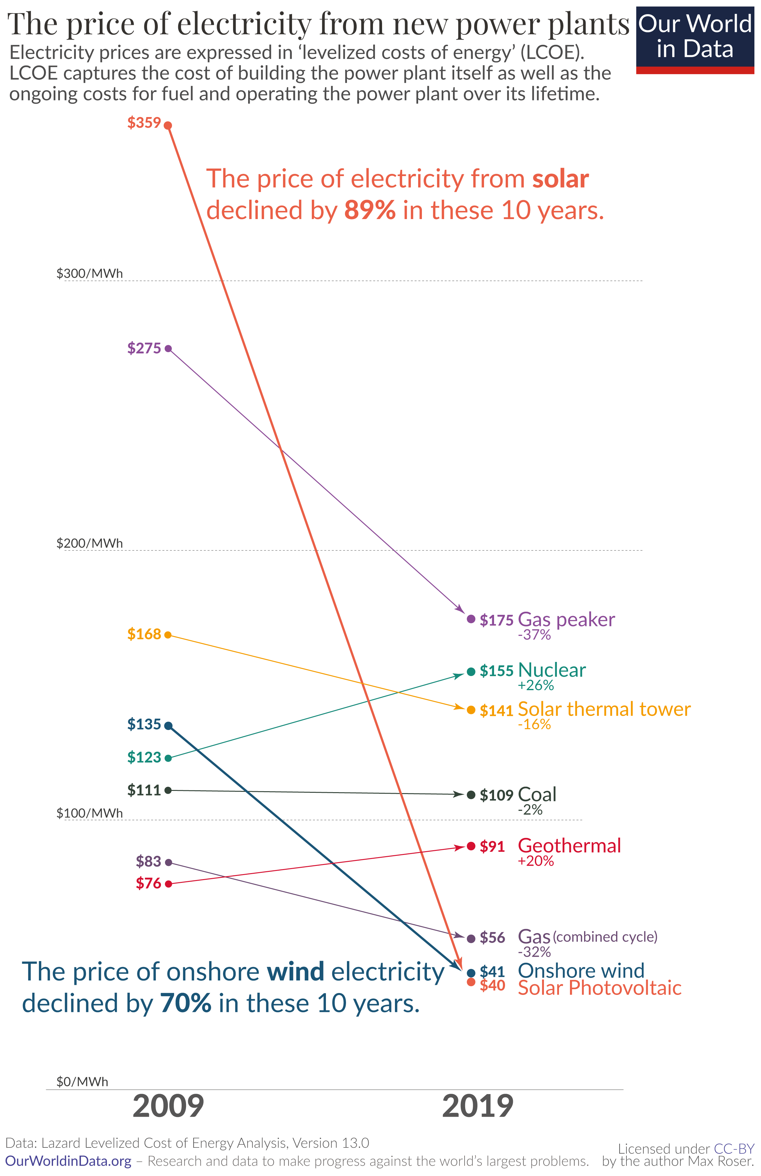
Recently I came across a beautiful data analytics website while I was reading on why renewable energy is showing greater and greater momentum in replacing traditional fossil fuel-based energy. I was mesmerized by the graphs there. Here is an example:

Astounding, isn’t it?
As the credit on the bottom of the chart shows, the website is called ourworldindata.org. I suspected that it is from a higher education institution, so I dug a little on its website. I was right – it is out of Oxford University. — Great work, colleagues on the other side of the pond! I expect to read this website on a daily basis.
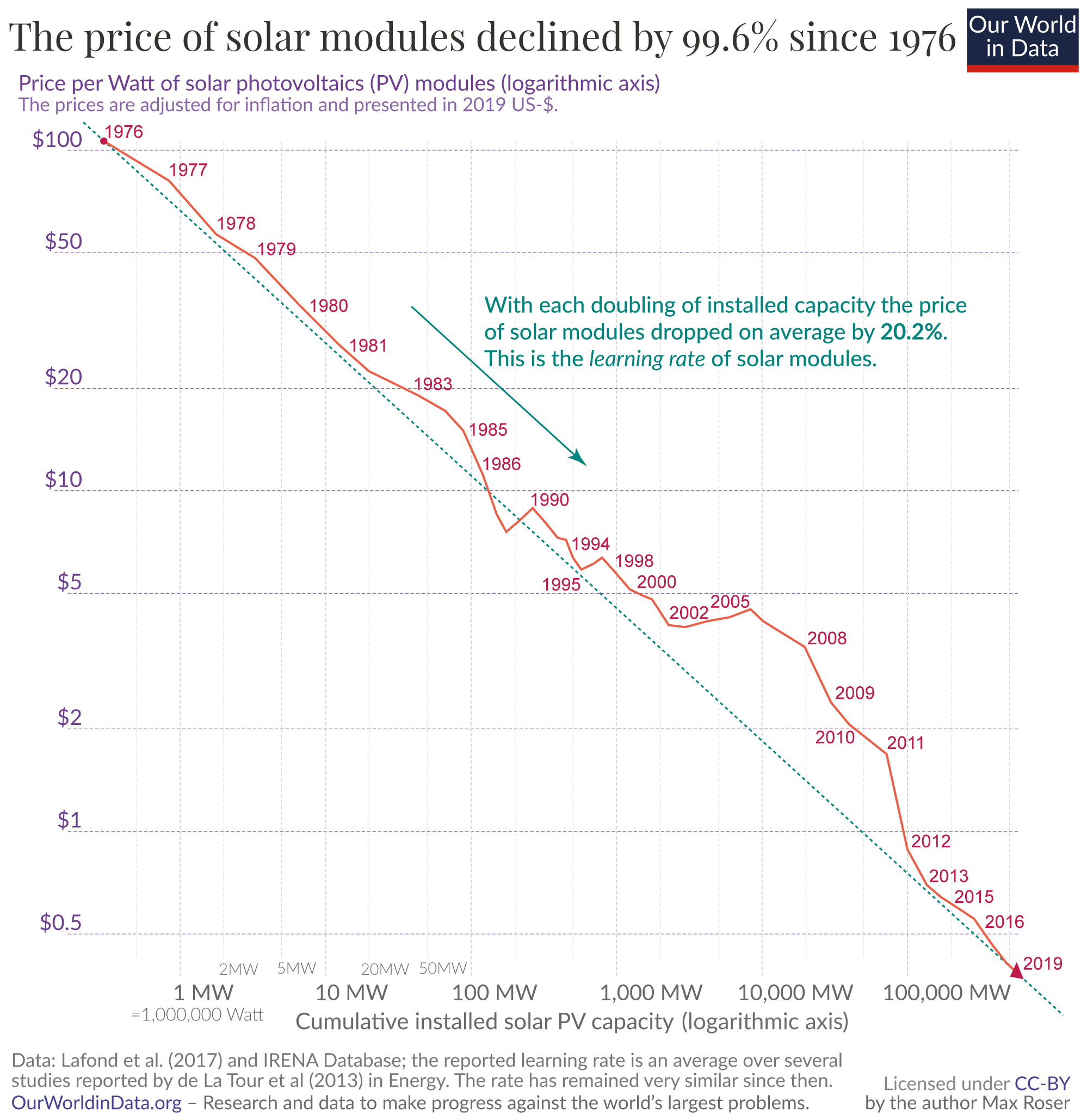
Now back to my original quest. – Why did solar energy price fall so rapidly? Again, the above mentioned article offers a convincing answer: learning curves.
Leave a Reply
You must be logged in to post a comment.