Category: work efficiency
-

What is Your Favorite Data Source?
My students and I recently began a crowd-sourcing project – To collect some of the most worthy data-centric websites, so that others can learn and share as well. We need your help too! To contribute, just go the document below and type away! (If the table below does not work, here is the direct link)…
-

All Great Boston Area Towns Benefitting from the Housing Boom? Not Quite So
I recently came across an interesting summary table on median condo prices in the Great Boston area (re-created in Excel below; original data from the Boston Magazine, whose link is here) Median prices probably are probably a good measure instead of averages because they might be skewed by very expensive high-end buildings. Nevertheless I was…
-
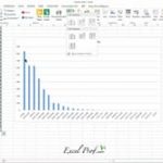
How to Draw a Pareto Chart?
Pareto chart, put simply, is a sorted frequency chart. It is used mainly for identifying the most frequent occurrences in a collected sample. Some business-situation questions can be answered by a Pareto chart include: — What are the most common service duration in a process? — Which aspect do our customers like best? —…
-
Sparkline (aka chart-in-a cell) really sparkles!
In many cases, you need to generate a series of graphs using Excel, and yet do not want to put them into one single picture. For example, you would like to draw the price movement of each of 10 individual stock. As you can imagine, having 10 separate line charts in one worksheet will make…
-
The New Histogram Tool in Excel 2016 is Handy-Dandy
Let’s face it. The old histogram tool in Excel – the one hidden in Data Analysis – is a pain to use. You need to prepare a ‘Bin range’ to start with, which requires you to know the minimum, maximum, and the width of bin. Then PivotTable came along, and provided a quite handy…
-
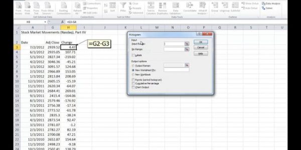
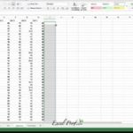
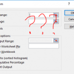
To build a frequency distribution chart, do NOT use Excel’s Histogram add-in tool
A histogram (also called a frequency distribution chart) shows how many times a specific value occurs within a certain range. It is super-useful if you want to know how a variable is statistically distributed. But Excel’s built-in histogram tool is not the best tool to use: It requires you to specific “bin values” before hand, which requires…
-
Flashfill in one of my favorite new feature in Excel
In Excel 2013 and later, there has been a significant push towards “intelligent computing”. Flashfill is one of the most significant new features under this push. See video below. Previously, if you want to parse a telephone number, you need to know a few text processing functions. But now, Excel can rightly guess what you are…