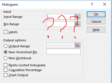
Let’s face it. The old histogram tool in Excel – the one hidden in Data Analysis – is a pain to use. You need to prepare a ‘Bin range’ to start with, which requires you to know the minimum, maximum, and the width of bin.
Then PivotTable came along, and provided a quite handy tool to plot histogram (Take a look at this video on how to plot a histogram with PivotTable).
It is much more convenient, but still you need to think a bit and pay attention to intervals with no data points.
Want a one-button-click solution? Now with Excel 2016 (PC version only for now, sorry Mac users), now you can. Take a look at this button:
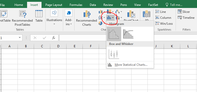
After selecting you data, just press on that button… Voila!
You can then right click and change all kinds of settings.
Well done, Microsoft!