Category: data
-
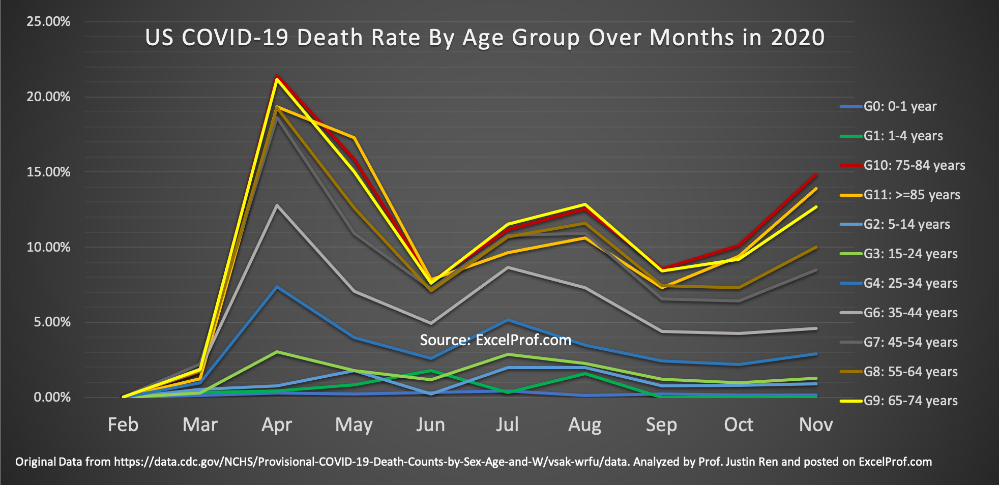
Why Hasn’t Anybody Done This Graph about COVID-19?
The COVID-19 pandemic has been going on for over 9 months now (I am writing this in mid-December of 2020). One question that I have always been thinking about: Has the risk of dying from COVID changed over time? In particular, have younger people become more risky of dying from contracting the virus? I have…
-
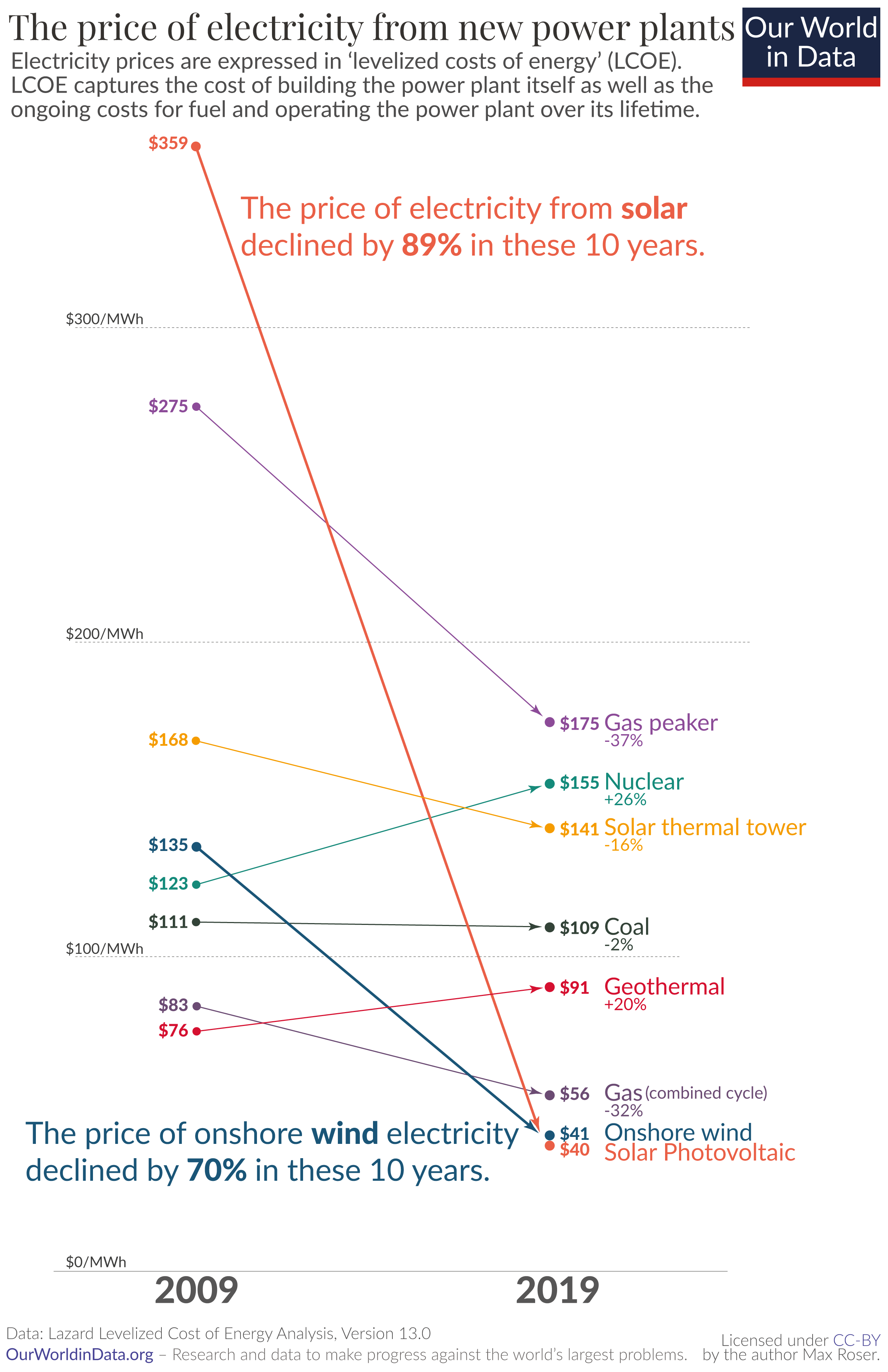
Wow What a Great Data Site
Recently I came across a beautiful data analytics website while I was reading on why renewable energy is showing greater and greater momentum in replacing traditional fossil fuel-based energy. I was mesmerized by the graphs there. Here is an example: Astounding, isn’t it? As the credit on the bottom of the chart shows, the website…
-
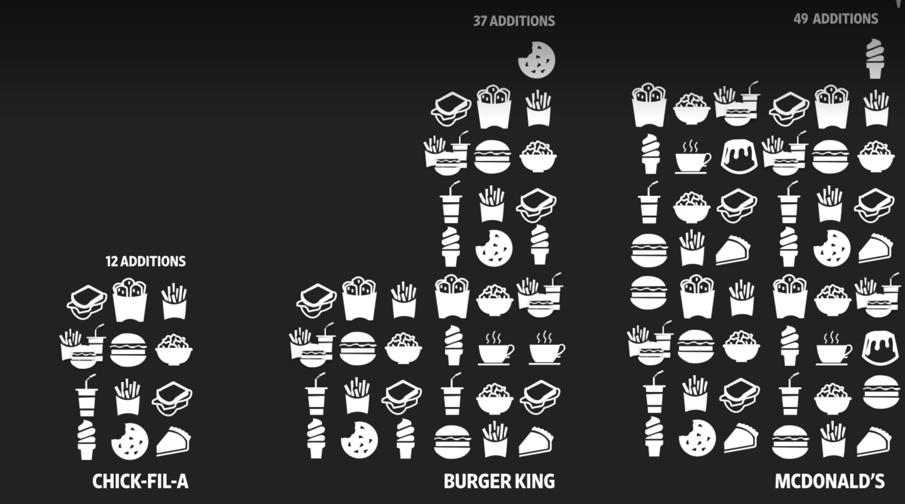
Why is Chick-Fil-A Picking up Market Share (and Why is McDonalds Testing Robot Fryers and Voice-Activated Drive-Through)?
WSJ recently ran an interesting article (and video) on how and why McDonalads is testing using robots to cook and voice-recognition software to take orders at drive-through. The why is simple. To quote the article: “Both technologies are meant to shorten customer wait times that executives acknowledge have grown in recent years. McDonald’s also has…
-
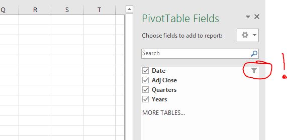
Filter Data Right in your Pivot Table Fields!
One of the ‘hidden treasure’ in Pivot Table a lot of people do not know about is that you can filter data right in your Pivot Table Fields. This is extremely useful if you already know before you do your Pivot Table analysis that you would like to select and use only a subset of…
-
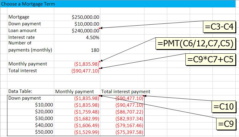
Sensitivity Study (or Scenarios) with Data Table
In managerial decision making, many time we need more than just an optimal decision. Often we would like to know how my results change if I change my decision in a certain way, or if one of the environmental parameters change. In other words, we want to do what-if analysis. In Excel this is made…
-

PivotTable: Calculated Fields
Sometime, after you have made a PivotTable you realize you might want to do some further calculations based on the summary results. For example, After getting the total revenue of a company by each division, and the total number of orders for each division, then you might want to calculate the revenue per order -right…
-
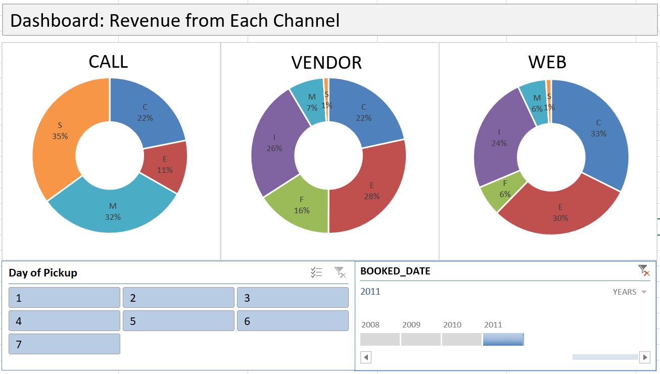
Dashboard with PivotTable
Dashboard is an effective communication tool to summary and highlight your data and your analysis. Here is an example of an Excel Dashboard that I made with PivotTable (and doughnut charts). Download the Excel file here. How do you make an effective dashboard? Here are what I consider some key steps: 1- Have a goal. What…
-
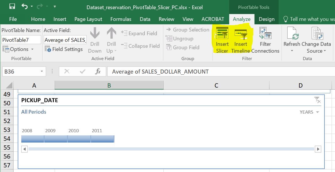
Data Slicer and Timeline are Useful Reporting Tools in PivotTable
Most of us know how to use a Filter in PivotTable, but do you know that there is an even better tool in slicing data in PivotTable? Yes, there is, and the name is, well, Data Slicer. Along with the generic slicer that works for every column, there is another slicer that works specifically for…
-
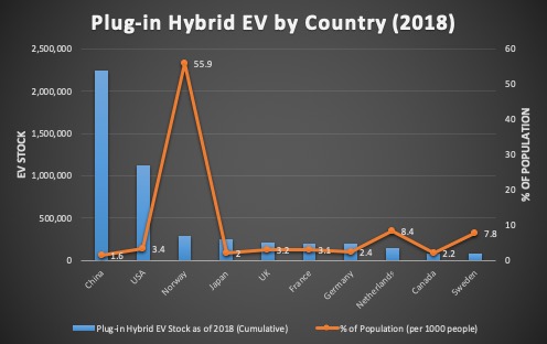
How to Draw a Combo Chart, i.e. Chart with 2 Y-axis, and Change Chart Type on a Mac
When two columns of data are of different scale, you will need to use a combo chart to plot each column on a separate axis. In the video below, one column is numbers of Plug-in Hybrid Electric Vehicle (PHEV) by country, while the other column is percentage values normalized by country population. As you can…
-

How much gasoline do we American consumers buy each week? An Example of Excel Modeling
I am a fan of Bill Gates. But the reason I bring his name up in here is because he just demonstrated the power of logical thinking, something very important in Excel modeling. First of all, let’s watch this short video: In the video, Bill first asked an intriguing question: How much gasoline do we…
-

Most Used Excel Shortcut Keys – Mac and PC
Finally I found some time to sit down and compile a list of Excel shortcut keys that I personally consider most used (and thus most useful). Please note that these are only about 1/3 of all shortcut keys that are available for Microsoft. There are some that you may find most useful but are not…
-
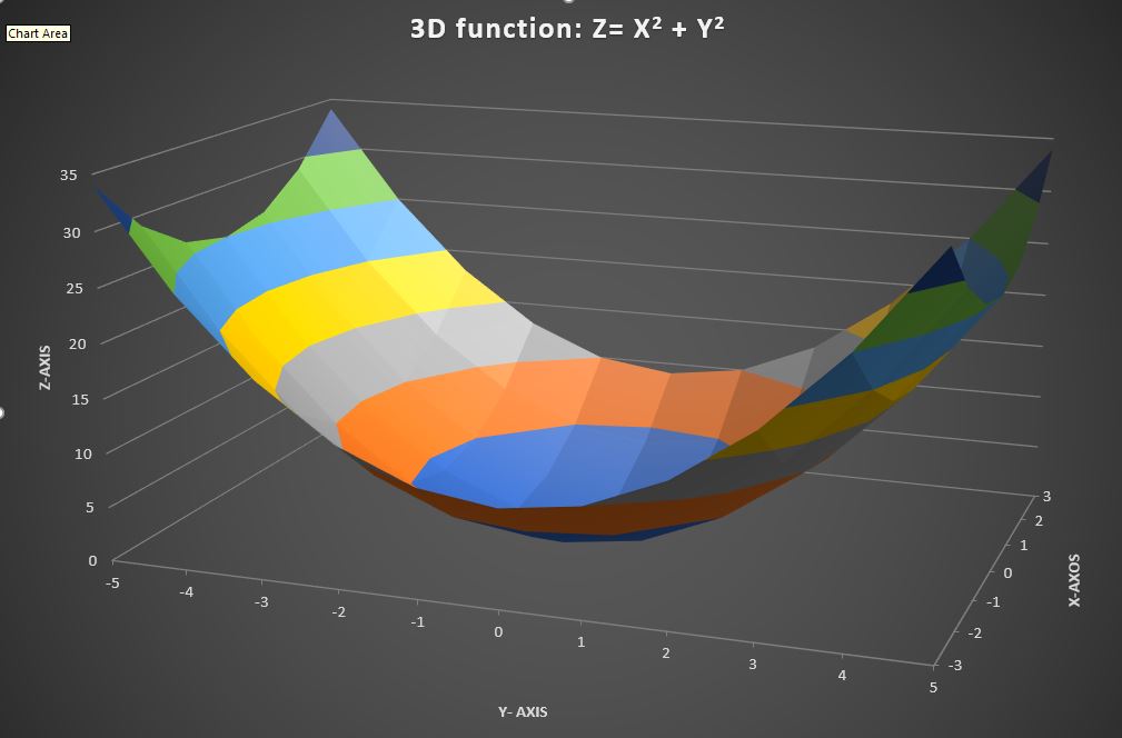
How to Draw a 3-D Chart
If you have 3-dimensional data, drawing a 3D chart can be very helpful in visualizing how the two variable jointly affect the outcome. In Microsoft Excel, such 3D charts are called “Surface Plots”. Here is a quick tutorial. Please note that your data will need to be in a table (Download Excel file here)in order…
-
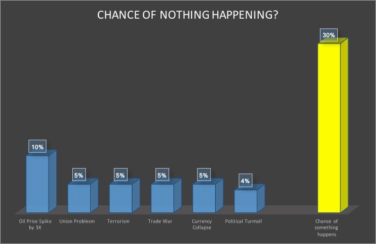
Chance of Nothing Happening? The Power of Joint Probabilities
Yesterday, as I was reading a book about Blackstone, the famed asset management company, something caught my attention. It was about how one of its executives describing evaluating risks in a potential deal: ” You say there’s a chance there’s a major terrorism event blowing up an airline, but that happens once in twenty years,…
-

This Site Has Abundant Climate Data
I have always been fascinated by climate data. Just today while researching for data on this topic, I came upon the Berkley Earth website and found that it has warehoused detailed climate data for the last 350 years! It has done quite some interesting analysis. For example, they have taken a long view on earth temperature…
-

Here is Another Example on Why Excel will Never Go Away – Julia Computing
Recently I had a conversation with a colleague who argues that Excel will die because he felt people are switching to other computing environments such as R. While I agree there are more people who are using other computing languages such as R, I do not agree Excel will be out of fashion very soon. …
-

Tesla Needs to Be More Rigorous in Discussing Numbers
Not to pick on Tesla – Many companies do this – But it really needs to be more rigorous in discussing its numbers. Take the most recent press release on its car safety as an example. In its Q3 2018 Vehicle Safety Report, it wrote the following: “ Over the past quarter, we’ve registered one…
-
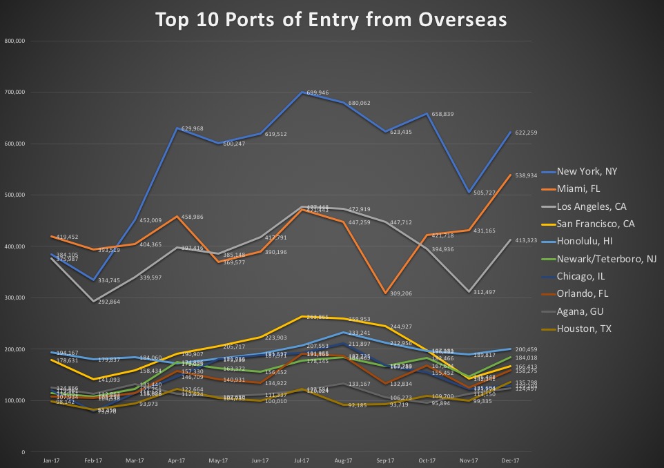
What (and when) are the most popular US cities to visit?
For some business reasons, I need to check what the most popular tourists destinations in the US are. It is not hard to find such data. The US National Travel and Tourism Office complied overseas visitor data which will shed some light on our questions. Here is the data link, in case you like to…
-
Google Sheets is Catching up with Excel in Charting
Excel is still my number one choice when it comes to graphing and charting, or just first-cut exploring, but I have notice that Google Sheets is also becoming more and more capable in its charting department. Do you know Google Sheets have Pivot Table? Do you know that it has a motion chart that even…
-

What is Your Favorite Data Source?
My students and I recently began a crowd-sourcing project – To collect some of the most worthy data-centric websites, so that others can learn and share as well. We need your help too! To contribute, just go the document below and type away! (If the table below does not work, here is the direct link)…
-

How to calculate Time Difference in Excel
Microsoft Excel has a function to calculate the numbers of days between two dates (DATEDIF), but there is no specific function to compute the hours and minutes between two times. Instead, you simply take the difference. But there are some issues to deal with. Let’s look at an example. The problem here is the format…