Dashboard is an effective communication tool to summary and highlight your data and your analysis.
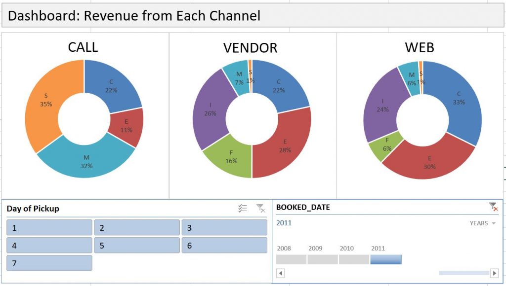
Here is an example of an Excel Dashboard that I made with PivotTable (and doughnut charts). Download the Excel file here.
How do you make an effective dashboard? Here are what I consider some key steps:
1- Have a goal. What exactly do you want to show? What not to show? Do you want people to show the data as well as the graphics? For each graph, what do you want people to focus on? A trend, or magnitude of certain numbers, or certain proportions?
2- Decide on types of charts. Based on your goal, use the most appropriate types of charts, whether it is a doughnut chart, or a line chart, or a sparkline. Whatever graphs you decide on, they need to clearly deliver your message.
3- If there are multiple layers of data that you would like users to play with on their own, consider use PivotTable slicers (just as the above example illustrates).
4- Experiment with different layout. But remember: Keep it simple. Do not show irrelevant information. Do not use too much fancy formatting.
Also, keep in mind, practice makes perfect. You are not going to make the best dashboard the first time around, but over time you will become better.