Category: video
-
Google Sheets is Catching up with Excel in Charting
Excel is still my number one choice when it comes to graphing and charting, or just first-cut exploring, but I have notice that Google Sheets is also becoming more and more capable in its charting department. Do you know Google Sheets have Pivot Table? Do you know that it has a motion chart that even…
-

How Advance do People Make Rental Car Reservations? The Result May Surprise You!
Spring break is upon us. Many students of mine are heading to exotic location, and quite a few of them have reserved rental cars many weeks earlier. But here is the question: When do most people make rental reservations? A week in advance? Or, just a few days in advance? I have worked with a…
-
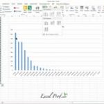
How to Draw a Pareto Chart?
Pareto chart, put simply, is a sorted frequency chart. It is used mainly for identifying the most frequent occurrences in a collected sample. Some business-situation questions can be answered by a Pareto chart include: — What are the most common service duration in a process? — Which aspect do our customers like best? —…
-
Sparkline (aka chart-in-a cell) really sparkles!
In many cases, you need to generate a series of graphs using Excel, and yet do not want to put them into one single picture. For example, you would like to draw the price movement of each of 10 individual stock. As you can imagine, having 10 separate line charts in one worksheet will make…
-
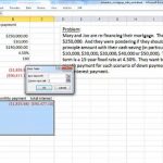
Data Table is a Secret Weapon in Excel Modeling and Analysis
Scenario analysis (also called What-ifs) is an indispensable part of business decision models. What is demand is only half of predicted? What if conversion rate is 50% higher? What if we drop our inventory by 1000 units? Once a decision model is built, it helps decision makers to test outcomes under various scenarios. Excel provides…
-

“That’s twice the size of Texas. They may never find us.”
Wait…what’s this? You might be wondering. What does it have to do with Excel modeling? Let me explain. First of all, this is a quote from the move Cast Away. Its main character Chuck, a Fedex executive, was washed onto the shore of a remote island after his plane was disintegrated in mid-air. …
-
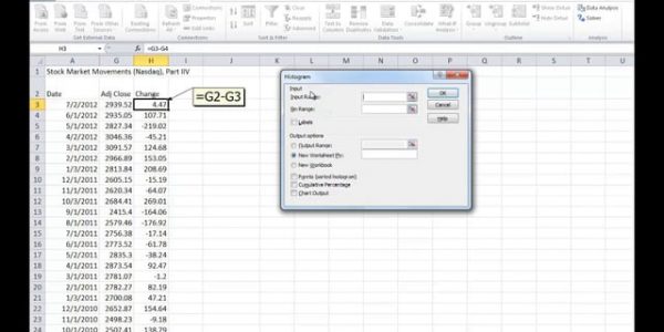
To build a frequency distribution chart, do NOT use Excel’s Histogram add-in tool
A histogram (also called a frequency distribution chart) shows how many times a specific value occurs within a certain range. It is super-useful if you want to know how a variable is statistically distributed. But Excel’s built-in histogram tool is not the best tool to use: It requires you to specific “bin values” before hand, which requires…
-
Flashfill in one of my favorite new feature in Excel
In Excel 2013 and later, there has been a significant push towards “intelligent computing”. Flashfill is one of the most significant new features under this push. See video below. Previously, if you want to parse a telephone number, you need to know a few text processing functions. But now, Excel can rightly guess what you are…
-

Excel Tutorial: How to Load Solver in Excel (Mac)
More and more people are using Excel as an optimization tool. Speaking of optimization, Excel Solver is at the center of it. However, many people seem to have problem finding Solver in Excel. I plan to write a series of posts on this topic, but for starter here is a video on how to load…