Category: tutorial
-
Excel trick: Search for multiple keywords from a list
Recently I was given a large spreadsheet with people’s expertise written in long phrases, and I had to identify those people who have AI-related expertise. The issue here is that people can enter a variety of phrases such as “machine learning”, or “large language model”. How do I quickly identify those people? Fortunately we can…
-
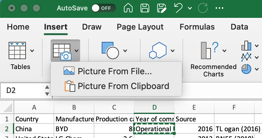
Excel Trick: Import Data From a Picture!
Have you ever looked at a table in a PDF file (or a picture) and wanted to import it into Excel? This video tells you how! As shown in the short video, this function is not perfect – but its usefulness far exceeds its imperfections! You may still need to edit the imported table a…
-
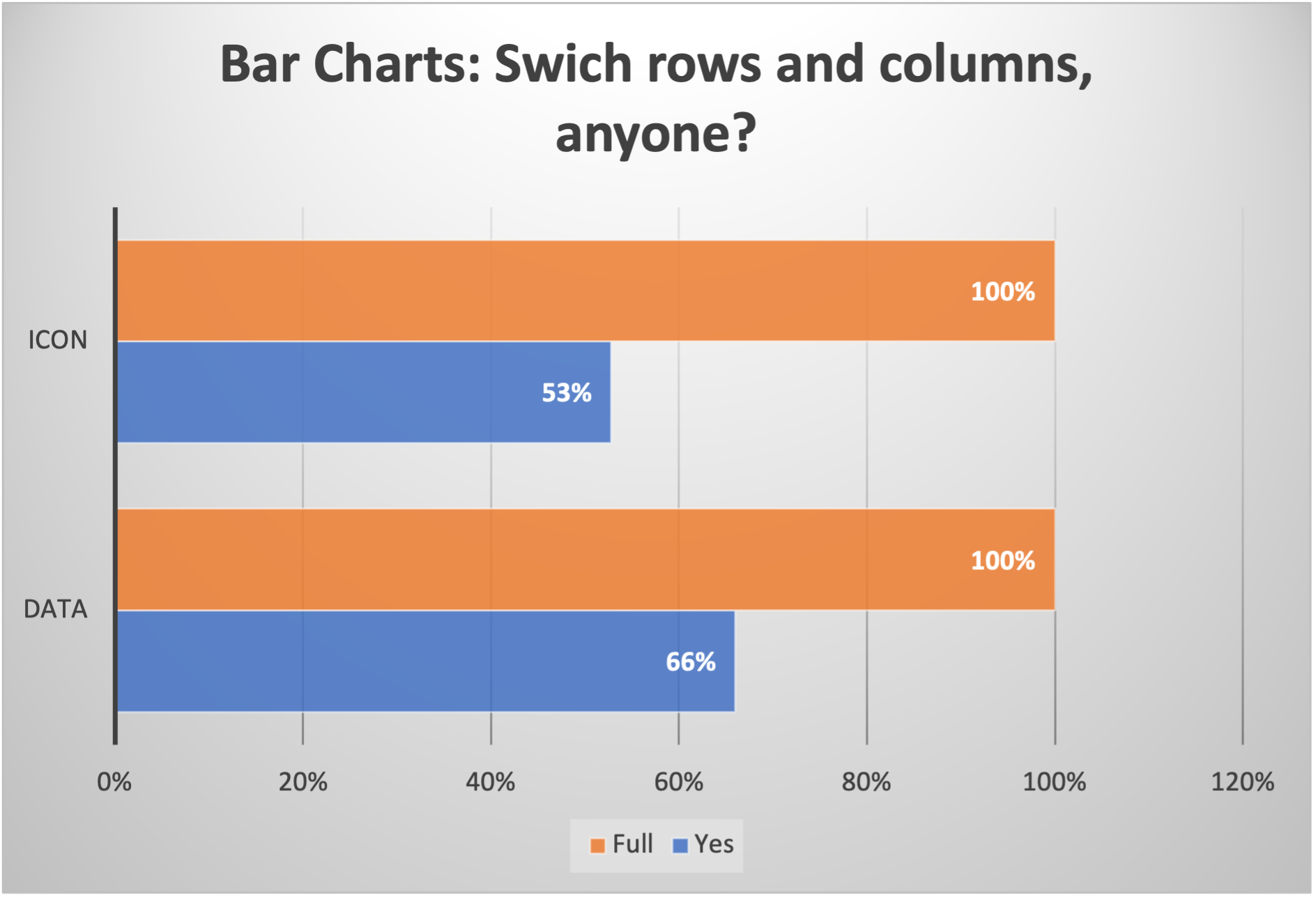
Clustered bar chart and stacked barcharts, switch rows/columns, overlap and customize shapes
Bar charts are one of the most frequently used charts. To use them effectively to generate on-the-point graphs that deliver exactly the right message, however, requires some deeper understanding as well as a few tricks to make them more appealing. I made a quick video that talks about: 1- The basic difference between clustered bar…
-
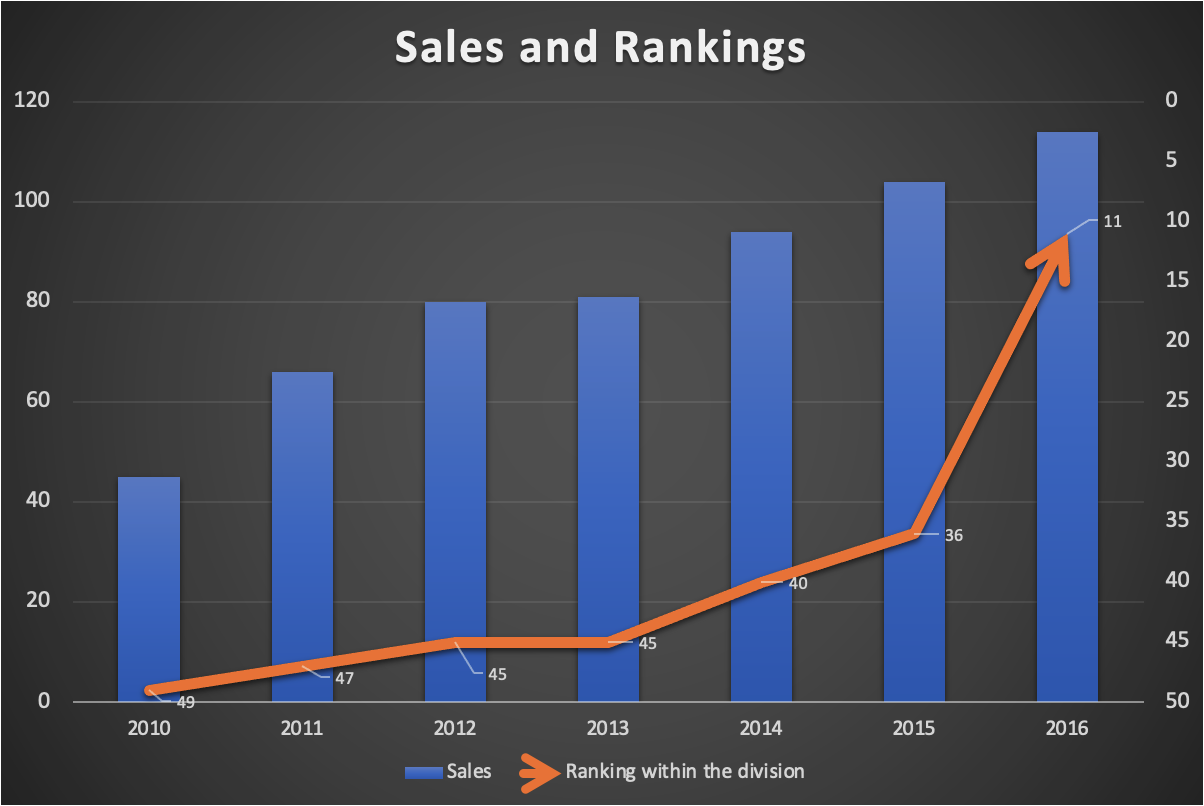
How to draw ranking data properly
A slight problem with drawing data on ranking is how we normally think about ranking. We normally associate “#1” as the best, and “#10” as worse compared to “#1”. But Excel chart typically shows a bigger number in a higher vertical position, and a smaller number in a lower position, as is shown in the…
-
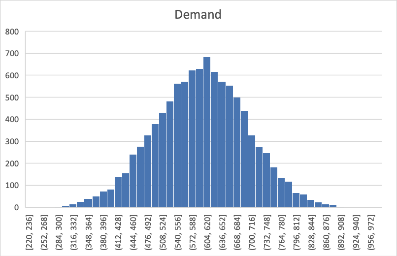
Simulation: Is demand equal to sales? (Part II, and why is there a Loch Ness Monster?)
In an earlier post, we discussed the difference between demand and sales using a simulation exercise. Now the question is: How can we visualize the difference? To start off, we all know the shape of the normal curve (in the example we discussed the mean is 600, and its standard deviation is 100): However, if…
-

Simulation: It all starts with a coin toss
There are many sophisticated tools dedicated to Monte Carlo simulation, but Excel is powerful enough to handle a variety of simulation needs. Here are the basic steps of simulation in Excel. First the users build a decision model in a spreadsheet and specify what are the sources of uncertainty. Excel can then generate random numbers…
-
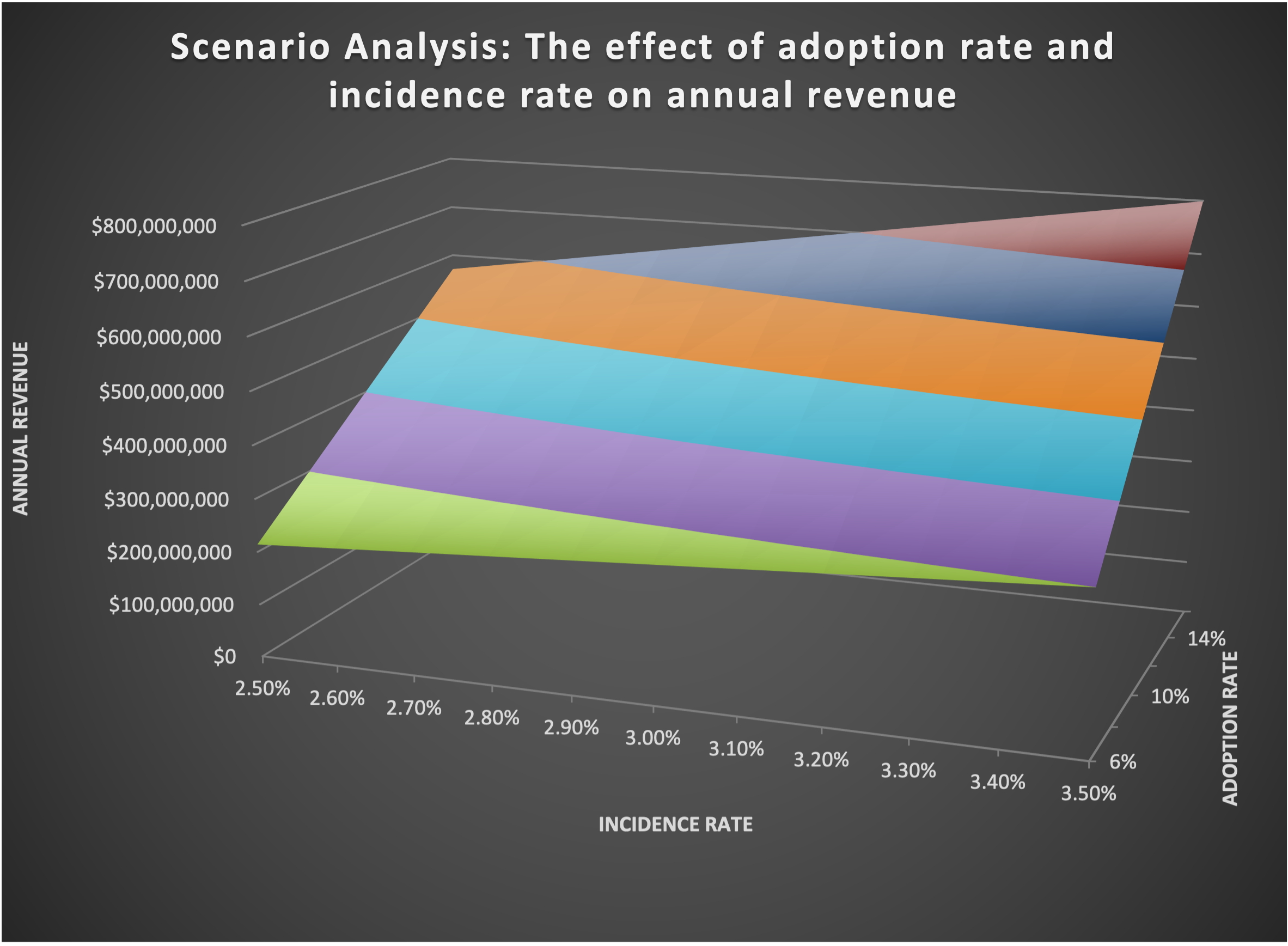
Two-way Data Table in Excel is a great tool for sensitivity analysis
In an earlier post, I have introduced Data Table as a “secret weapon” to conduct sensitivity analysis. Now let’s go one step further and look at a more advanced type of Data Table called Two-way Data Table. As the name suggests, it offers a way to study the joint effect of TWO variable on the…
-
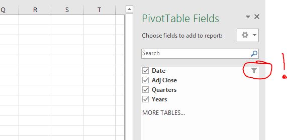
Filter Data Right in your Pivot Table Fields!
One of the ‘hidden treasure’ in Pivot Table a lot of people do not know about is that you can filter data right in your Pivot Table Fields. This is extremely useful if you already know before you do your Pivot Table analysis that you would like to select and use only a subset of…
-
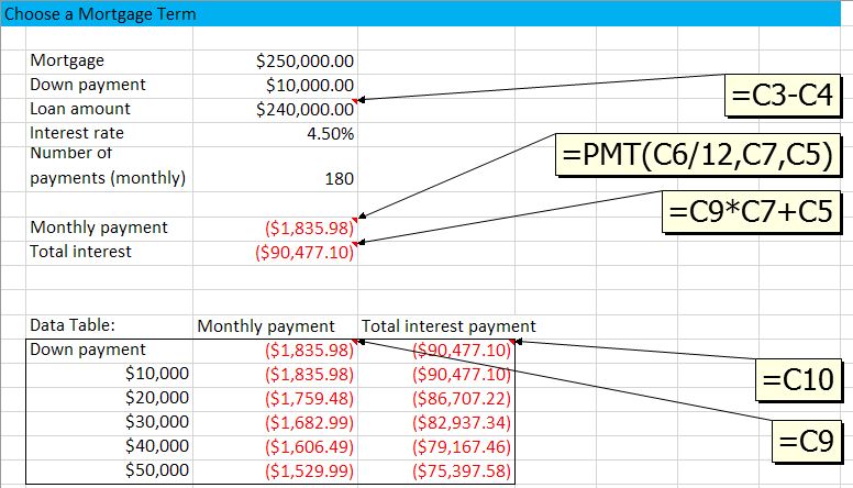
Sensitivity Study (or Scenarios) with Data Table
In managerial decision making, many time we need more than just an optimal decision. Often we would like to know how my results change if I change my decision in a certain way, or if one of the environmental parameters change. In other words, we want to do what-if analysis. In Excel this is made…
-

PivotTable: Calculated Fields
Sometime, after you have made a PivotTable you realize you might want to do some further calculations based on the summary results. For example, After getting the total revenue of a company by each division, and the total number of orders for each division, then you might want to calculate the revenue per order -right…
-
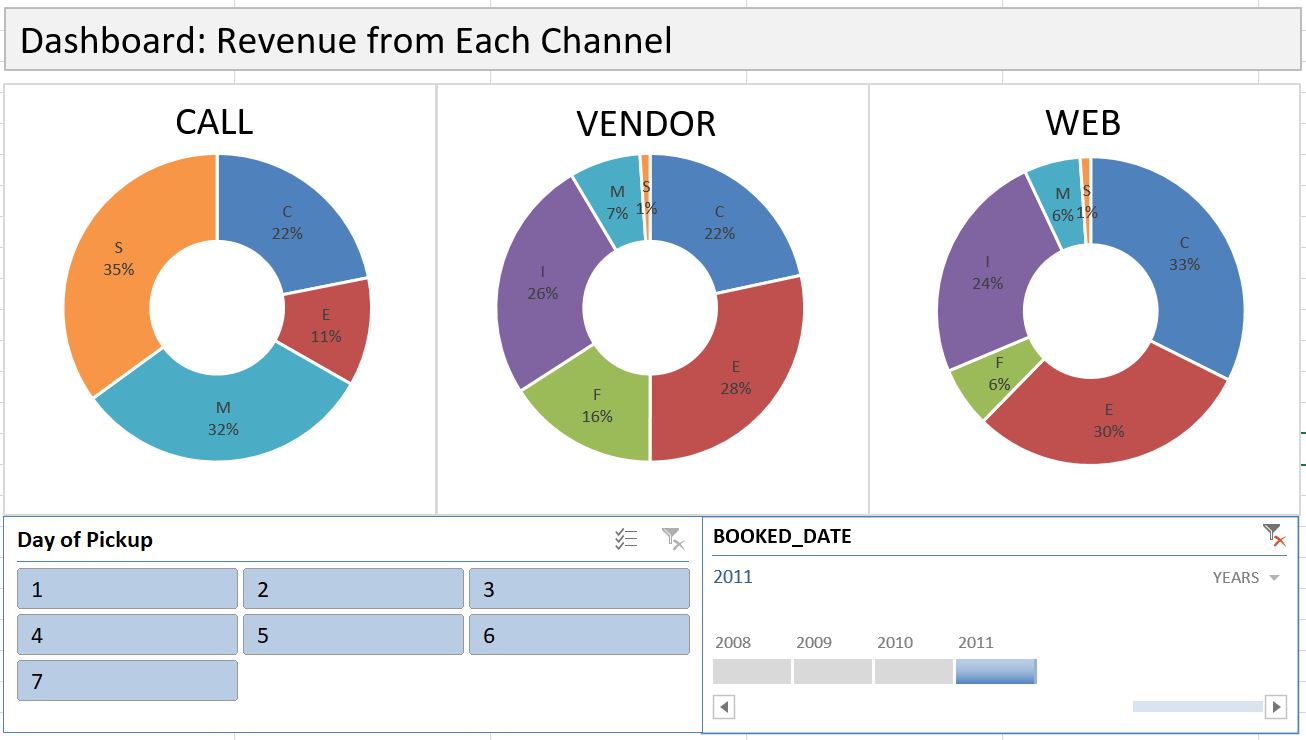
Dashboard with PivotTable
Dashboard is an effective communication tool to summary and highlight your data and your analysis. Here is an example of an Excel Dashboard that I made with PivotTable (and doughnut charts). Download the Excel file here. How do you make an effective dashboard? Here are what I consider some key steps: 1- Have a goal. What…
-
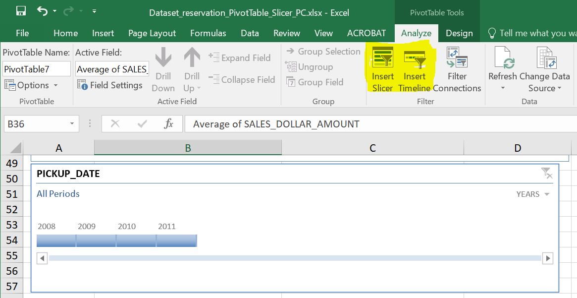
Data Slicer and Timeline are Useful Reporting Tools in PivotTable
Most of us know how to use a Filter in PivotTable, but do you know that there is an even better tool in slicing data in PivotTable? Yes, there is, and the name is, well, Data Slicer. Along with the generic slicer that works for every column, there is another slicer that works specifically for…
-
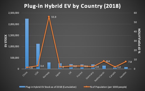
How to Draw a Combo Chart, i.e. Chart with 2 Y-axis, and Change Chart Type on a Mac
When two columns of data are of different scale, you will need to use a combo chart to plot each column on a separate axis. In the video below, one column is numbers of Plug-in Hybrid Electric Vehicle (PHEV) by country, while the other column is percentage values normalized by country population. As you can…
-

How much gasoline do we American consumers buy each week? An Example of Excel Modeling
I am a fan of Bill Gates. But the reason I bring his name up in here is because he just demonstrated the power of logical thinking, something very important in Excel modeling. First of all, let’s watch this short video: In the video, Bill first asked an intriguing question: How much gasoline do we…
-

Most Used Excel Shortcut Keys – Mac and PC
Finally I found some time to sit down and compile a list of Excel shortcut keys that I personally consider most used (and thus most useful). Please note that these are only about 1/3 of all shortcut keys that are available for Microsoft. There are some that you may find most useful but are not…
-
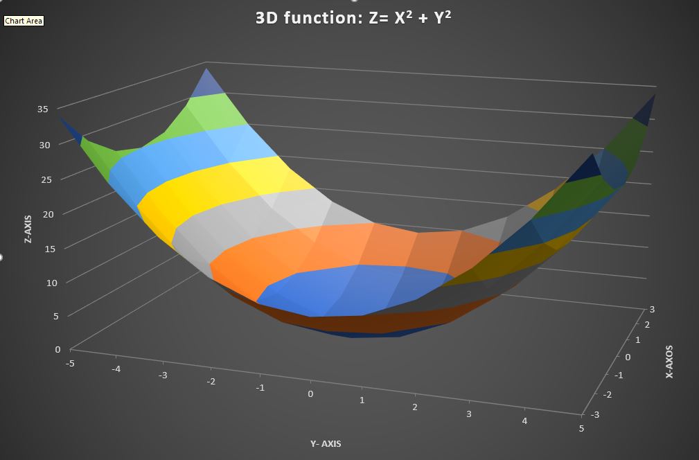
How to Draw a 3-D Chart
If you have 3-dimensional data, drawing a 3D chart can be very helpful in visualizing how the two variable jointly affect the outcome. In Microsoft Excel, such 3D charts are called “Surface Plots”. Here is a quick tutorial. Please note that your data will need to be in a table (Download Excel file here)in order…
-

How Advance do People Make Rental Car Reservations? The Result May Surprise You!
Spring break is upon us. Many students of mine are heading to exotic location, and quite a few of them have reserved rental cars many weeks earlier. But here is the question: When do most people make rental reservations? A week in advance? Or, just a few days in advance? I have worked with a…
-
How to Draw a Pareto Chart?
Pareto chart, put simply, is a sorted frequency chart. It is used mainly for identifying the most frequent occurrences in a collected sample. Some business-situation questions can be answered by a Pareto chart include: — What are the most common service duration in a process? — Which aspect do our customers like best? —…
-
Sparkline (aka chart-in-a cell) really sparkles!
In many cases, you need to generate a series of graphs using Excel, and yet do not want to put them into one single picture. For example, you would like to draw the price movement of each of 10 individual stock. As you can imagine, having 10 separate line charts in one worksheet will make…
-
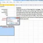
Data Table is a Secret Weapon in Excel Modeling and Analysis
Scenario analysis (also called What-ifs) is an indispensable part of business decision models. What is demand is only half of predicted? What if conversion rate is 50% higher? What if we drop our inventory by 1000 units? Once a decision model is built, it helps decision makers to test outcomes under various scenarios. Excel provides…