Category: visulization
-
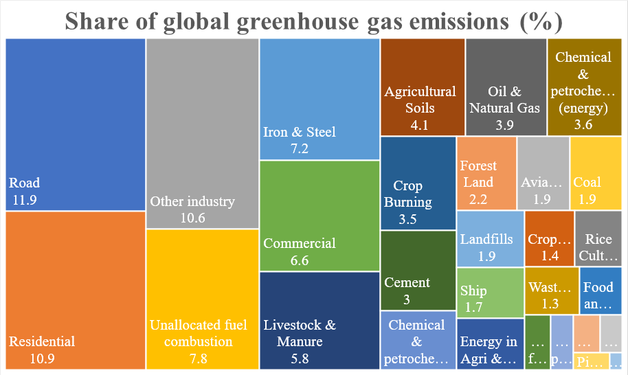
Road Transportation is the Single Largest Decarbonization Opportunity with a Clear Path Forward
My apology for the unwieldy title. But I chose the long title to highlight one thing: Although there are many decarbonization opportunities with large impact, road transportation offers the clearest path forward. Let me elaborate. First, let’s examine the areas where we need to reduce our carbon footprints. There are lots of high-quality research and…
-
Excel Pivot Table Trick: Drawing Charts Using Only Part of the Pivot Table
As I showed in a previous post about dash-boarding with Pivot Table, generating multiple charts with a Pivot Table can be very useful. But the problem is that Excel will automatically take the entire Pivot Table and generate a chart. You cannot even delete any data points from that chart(!), because they are part of…
-
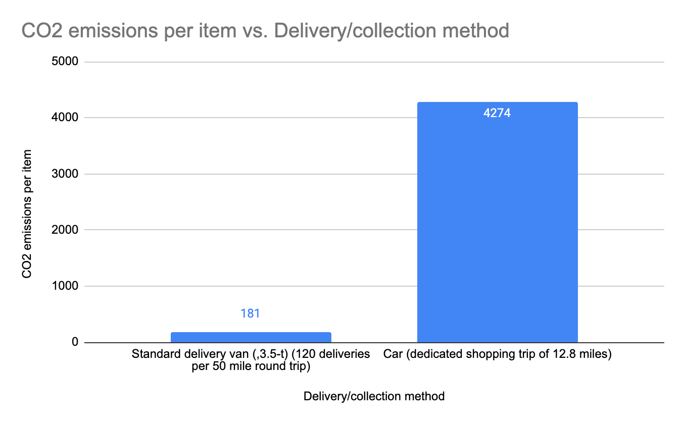
The Carbon-reducing Effect of E-commerce Delivery
In an early article I discussed the perils of higher carbon print in online grocery shopping (mainly from a paper by Van Loon et al (2015). However, let’s not forget that the paper did find that when it comes to delivery using dedicated vans carrying a large basket size (as opposed to just a few…
-
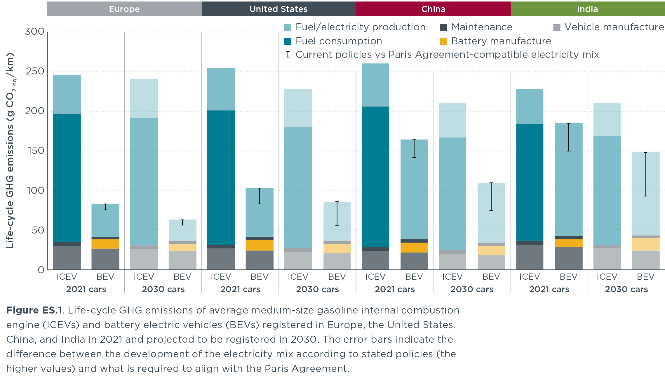
ICCT’s Report on the Lifecycle Comparisons of GHG Emissions of Gas Cars vs. EV is Filling a Void
Today The International Council on Clean Transportation release a report called “A global comparison of the life-cycle greenhouse gas emissions of combustion engine and electric passenger cars“, which I find a satisfying read. Its key findings can be highlighted in the following graph: The graph is quite dense, so let me point out a few…
-
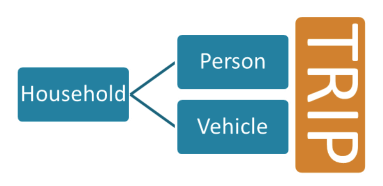
Modeling Driving Distances (2)
The National Household Travel Survey (NHTS) is probably the most comprehensive data source on driving behaviors of people in the US. It captures travel by US residents in all 50 States and the District of Columbia that includes trips made by “all modes of travel (private vehicle, public transportation, pedestrian and cycling) and for all…
-
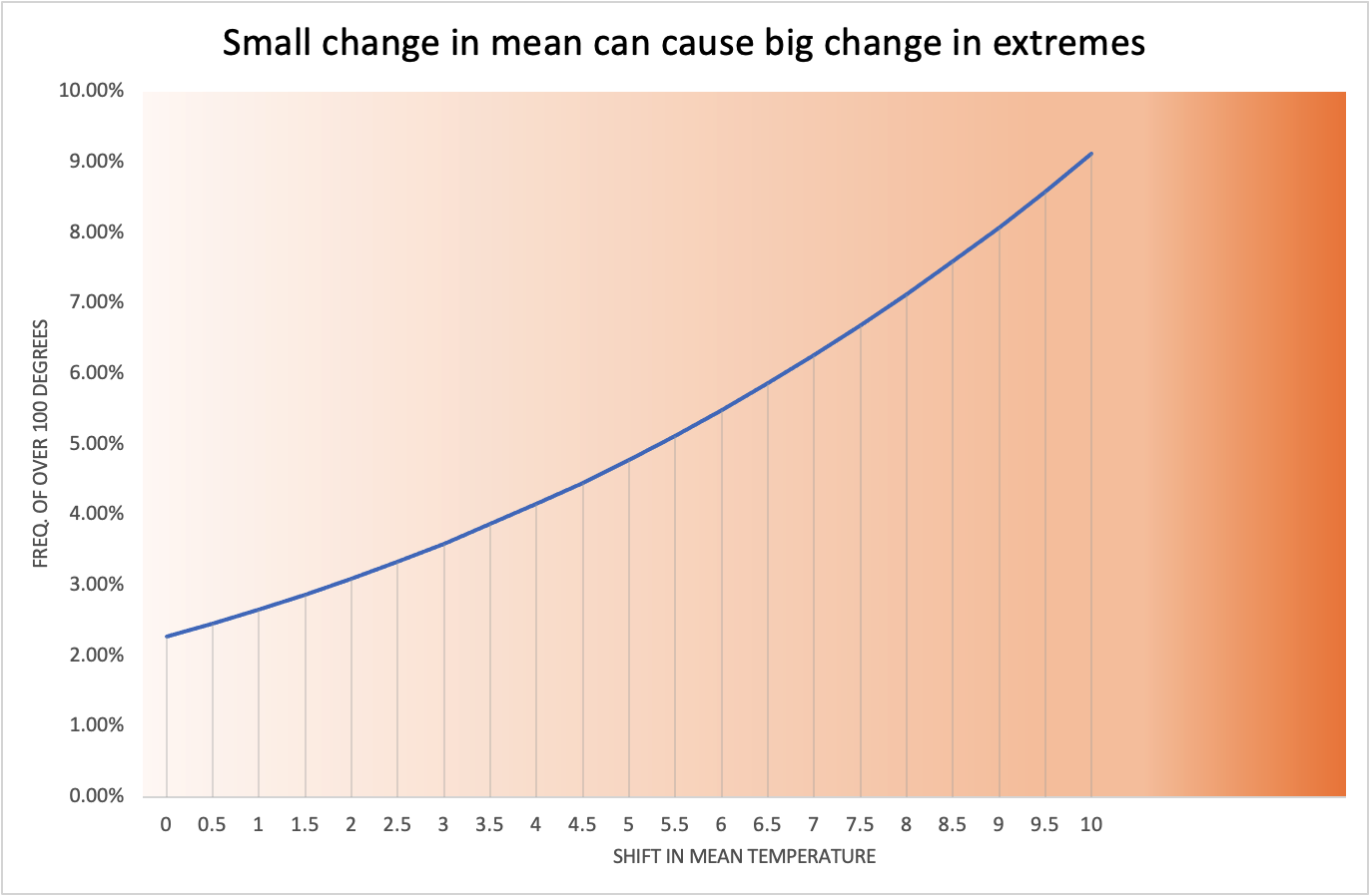
Small change in mean can result in big change in extremes
We have witnessed the recent extreme heat in the US Pacific Northwest. The city of Seattle (one of my favorite cities!) set a new record for the highest temperature ever recorded: 108 degrees. Incidentally the previous record high of 105 degrees was only 11 years ago in 2009. Why do we see extreme weathers more often? I think…
-
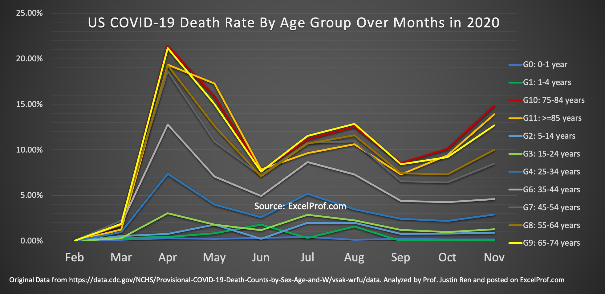
Why Hasn’t Anybody Done This Graph about COVID-19?
The COVID-19 pandemic has been going on for over 9 months now (I am writing this in mid-December of 2020). One question that I have always been thinking about: Has the risk of dying from COVID changed over time? In particular, have younger people become more risky of dying from contracting the virus? I have…
-
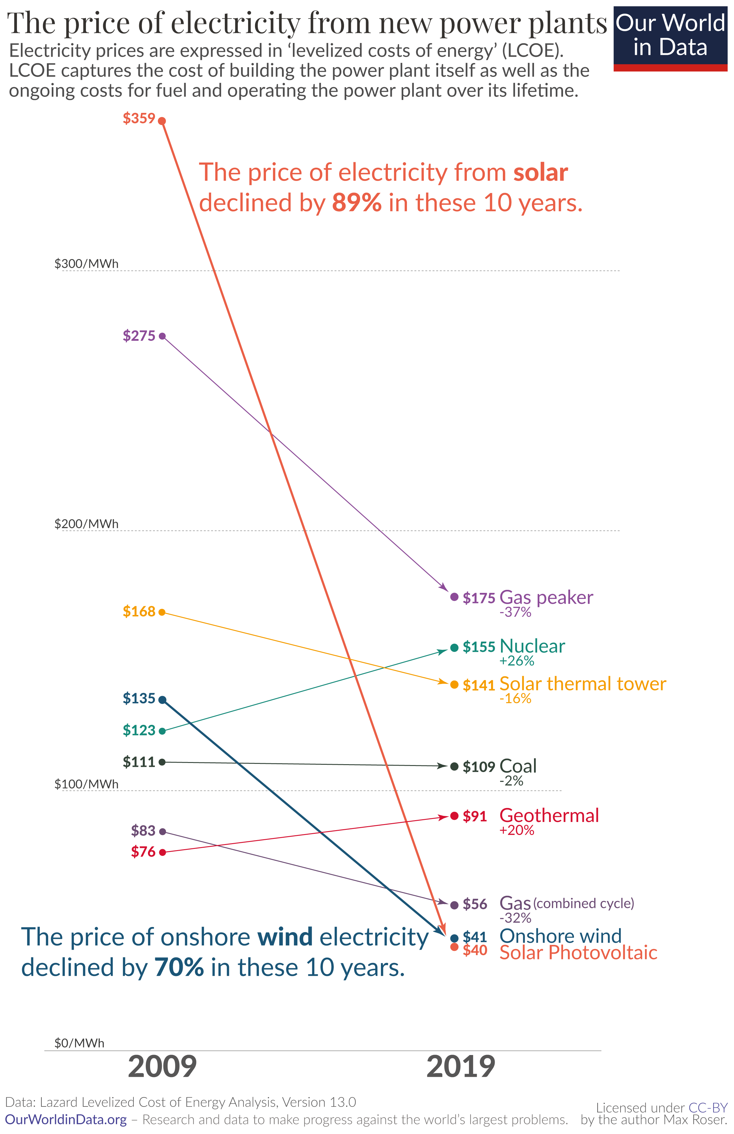
Wow What a Great Data Site
Recently I came across a beautiful data analytics website while I was reading on why renewable energy is showing greater and greater momentum in replacing traditional fossil fuel-based energy. I was mesmerized by the graphs there. Here is an example: Astounding, isn’t it? As the credit on the bottom of the chart shows, the website…
-
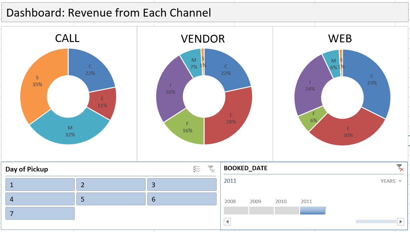
Dashboard with PivotTable
Dashboard is an effective communication tool to summary and highlight your data and your analysis. Here is an example of an Excel Dashboard that I made with PivotTable (and doughnut charts). Download the Excel file here. How do you make an effective dashboard? Here are what I consider some key steps: 1- Have a goal. What…
-
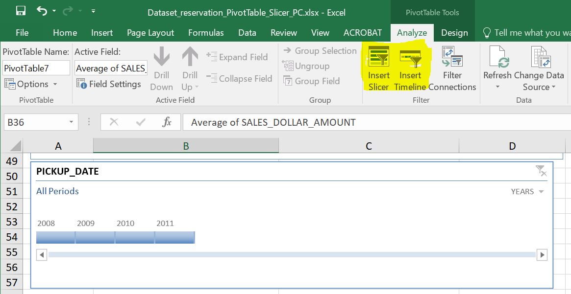
Data Slicer and Timeline are Useful Reporting Tools in PivotTable
Most of us know how to use a Filter in PivotTable, but do you know that there is an even better tool in slicing data in PivotTable? Yes, there is, and the name is, well, Data Slicer. Along with the generic slicer that works for every column, there is another slicer that works specifically for…
-
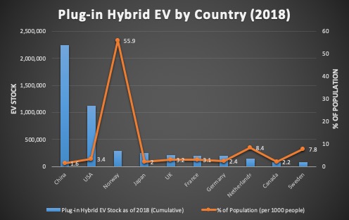
How to Draw a Combo Chart, i.e. Chart with 2 Y-axis, and Change Chart Type on a Mac
When two columns of data are of different scale, you will need to use a combo chart to plot each column on a separate axis. In the video below, one column is numbers of Plug-in Hybrid Electric Vehicle (PHEV) by country, while the other column is percentage values normalized by country population. As you can…
-
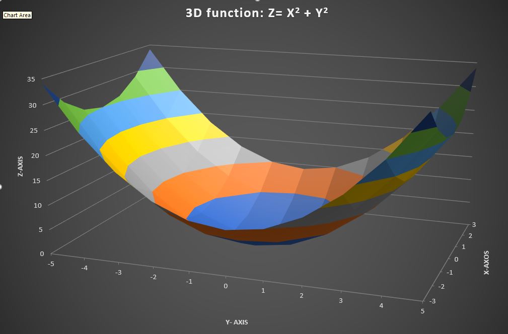
How to Draw a 3-D Chart
If you have 3-dimensional data, drawing a 3D chart can be very helpful in visualizing how the two variable jointly affect the outcome. In Microsoft Excel, such 3D charts are called “Surface Plots”. Here is a quick tutorial. Please note that your data will need to be in a table (Download Excel file here)in order…
-
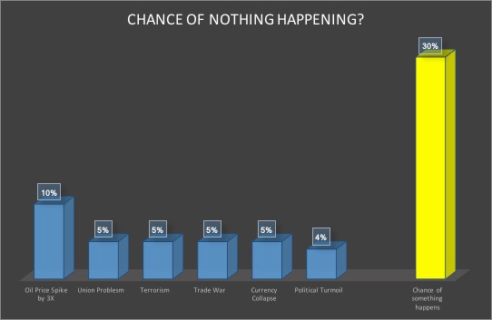
Chance of Nothing Happening? The Power of Joint Probabilities
Yesterday, as I was reading a book about Blackstone, the famed asset management company, something caught my attention. It was about how one of its executives describing evaluating risks in a potential deal: ” You say there’s a chance there’s a major terrorism event blowing up an airline, but that happens once in twenty years,…
-

This Site Has Abundant Climate Data
I have always been fascinated by climate data. Just today while researching for data on this topic, I came upon the Berkley Earth website and found that it has warehoused detailed climate data for the last 350 years! It has done quite some interesting analysis. For example, they have taken a long view on earth temperature…
-
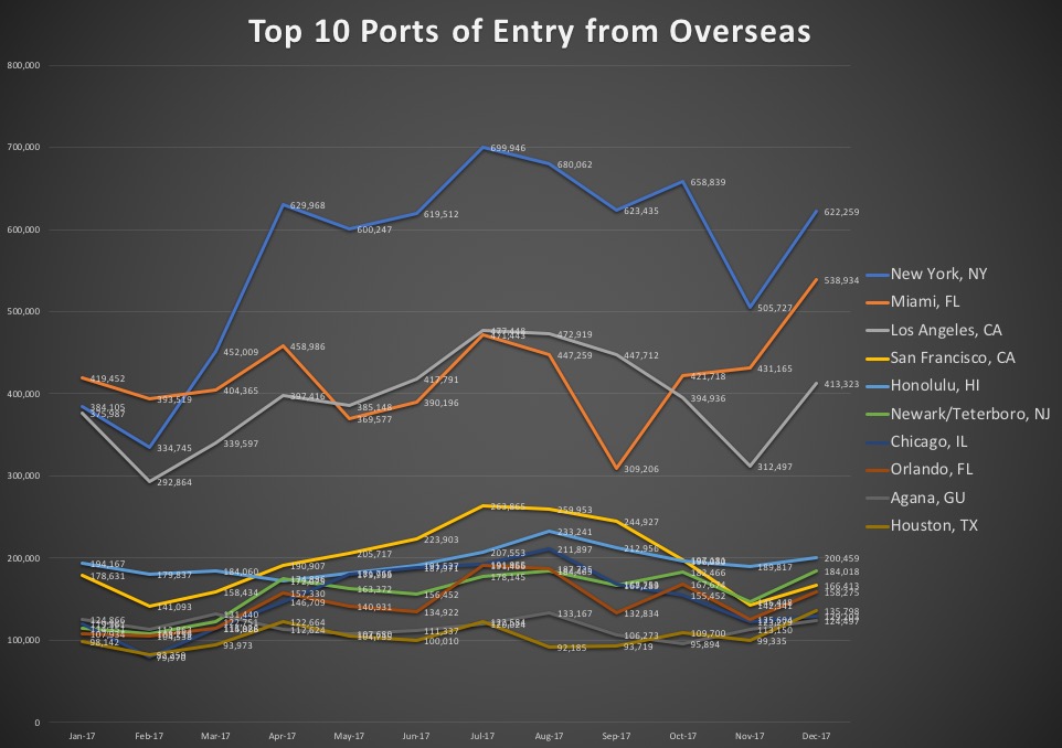
What (and when) are the most popular US cities to visit?
For some business reasons, I need to check what the most popular tourists destinations in the US are. It is not hard to find such data. The US National Travel and Tourism Office complied overseas visitor data which will shed some light on our questions. Here is the data link, in case you like to…
-

All Great Boston Area Towns Benefitting from the Housing Boom? Not Quite So
I recently came across an interesting summary table on median condo prices in the Great Boston area (re-created in Excel below; original data from the Boston Magazine, whose link is here) Median prices probably are probably a good measure instead of averages because they might be skewed by very expensive high-end buildings. Nevertheless I was…
-

How Advance do People Make Rental Car Reservations? The Result May Surprise You!
Spring break is upon us. Many students of mine are heading to exotic location, and quite a few of them have reserved rental cars many weeks earlier. But here is the question: When do most people make rental reservations? A week in advance? Or, just a few days in advance? I have worked with a…
-
How to Draw a Pareto Chart?
Pareto chart, put simply, is a sorted frequency chart. It is used mainly for identifying the most frequent occurrences in a collected sample. Some business-situation questions can be answered by a Pareto chart include: — What are the most common service duration in a process? — Which aspect do our customers like best? —…
-
Sparkline (aka chart-in-a cell) really sparkles!
In many cases, you need to generate a series of graphs using Excel, and yet do not want to put them into one single picture. For example, you would like to draw the price movement of each of 10 individual stock. As you can imagine, having 10 separate line charts in one worksheet will make…