Category: analytics
-
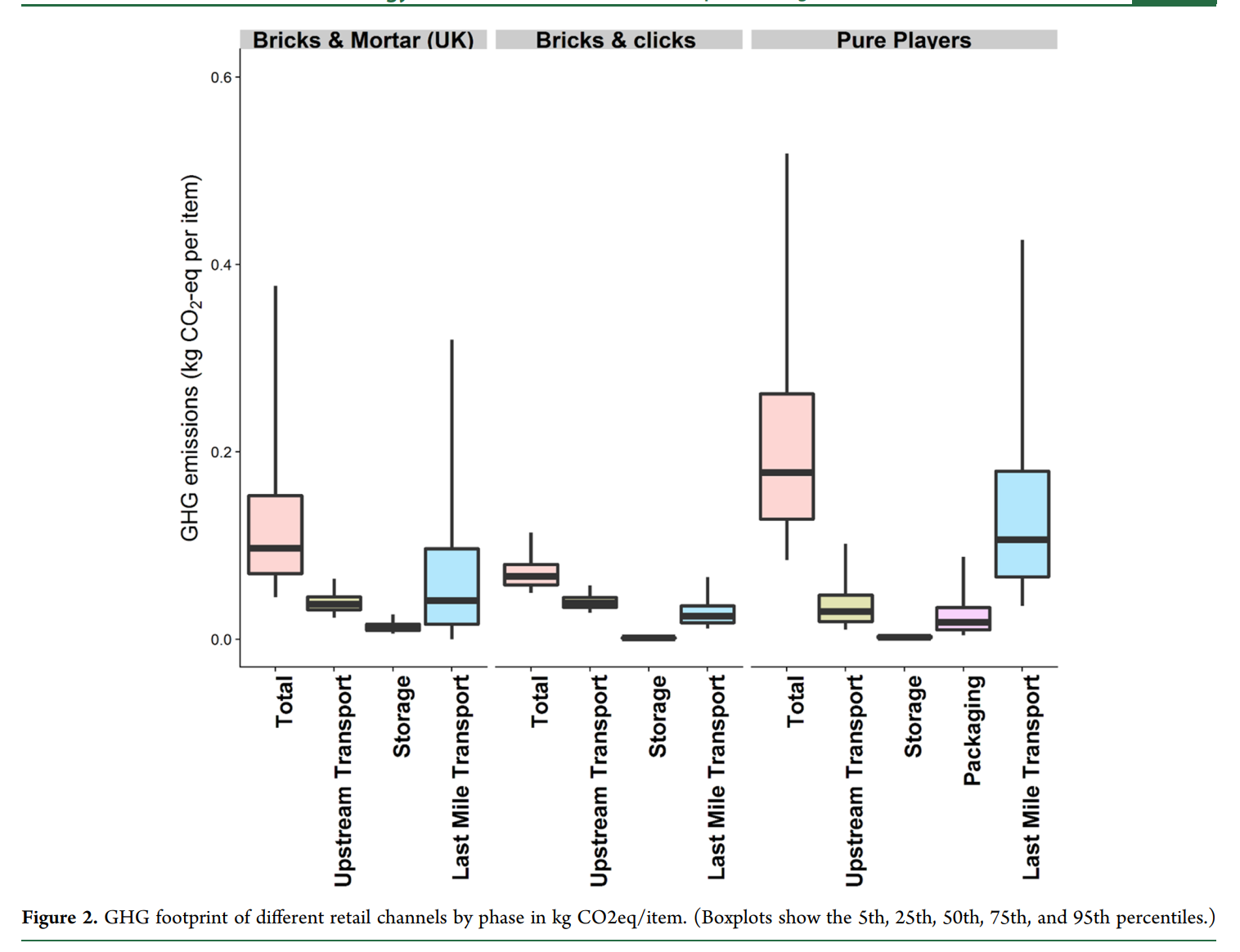
Last-mile Transport is the Key Driver in Supply Chain Carbon Footprint
Does online shopping have a larger or smaller carbon footprint? Well, it depends. But depends on what? In a most recently-published study by Shahmohammadi et al (2020) published in Environmental Science & Technology, the authors highlight that the last-mile transport is one of the most important drivers of carbon emissions, among other things. What I…
-

Elon Musk Gets Manufacturing
Why is large-scale manufacturing hard? This is one thing that many people do not quite grasp. And indeed it can be hard to explain, because there are a number of governing operations principles that are often in play at the same time. But when I read about what Elon Musk recently said about manufacturing, I…
-
Road Transportation is the Single Largest Decarbonization Opportunity with a Clear Path Forward
My apology for the unwieldy title. But I chose the long title to highlight one thing: Although there are many decarbonization opportunities with large impact, road transportation offers the clearest path forward. Let me elaborate. First, let’s examine the areas where we need to reduce our carbon footprints. There are lots of high-quality research and…
-
Excel Pivot Table Trick: Drawing Charts Using Only Part of the Pivot Table
As I showed in a previous post about dash-boarding with Pivot Table, generating multiple charts with a Pivot Table can be very useful. But the problem is that Excel will automatically take the entire Pivot Table and generate a chart. You cannot even delete any data points from that chart(!), because they are part of…
-
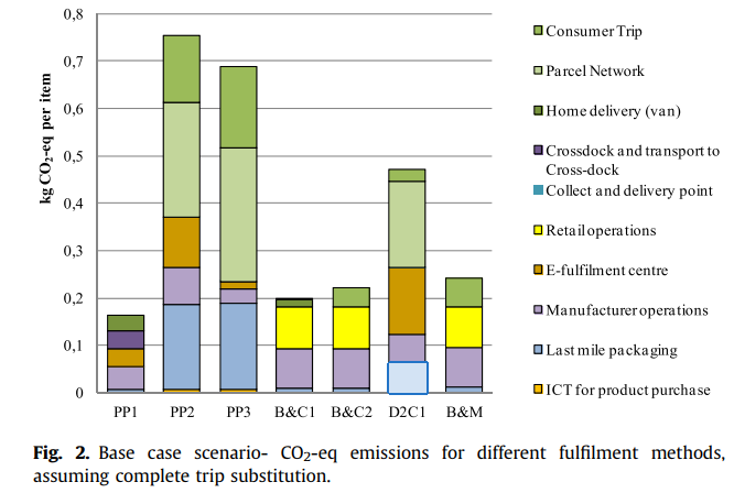
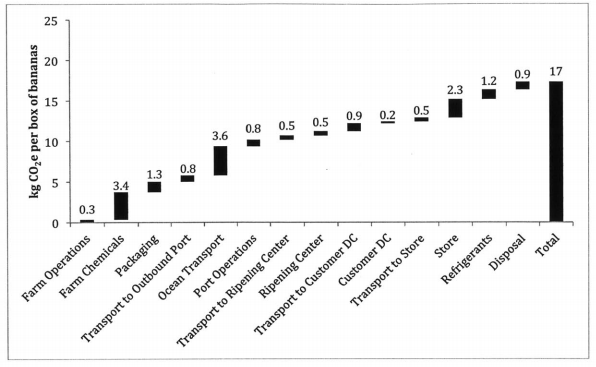
The sustainability peril of E-commerce (I): Small batches lead to more emissions
Recently I have been discussing with David Steven of Boston Strategy International, a world expert on sustainable supply chains, on the topic of carbon foot printing. One of the interesting points we talked about is the impact of the growth of the E-commerce sector on global carbon emissions. Researchers have been studying this for a…
-
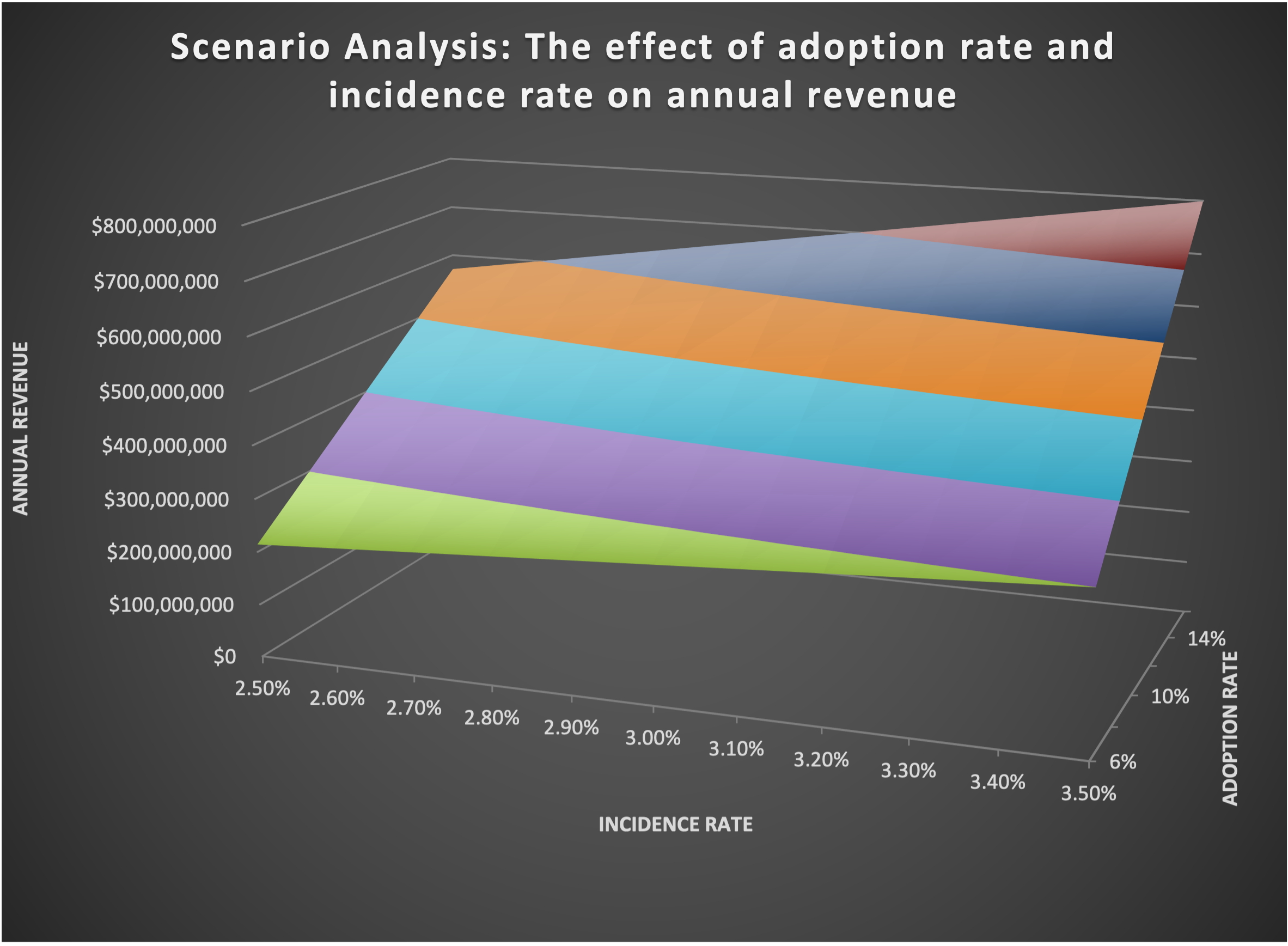
Two-way Data Table in Excel is a great tool for sensitivity analysis
In an earlier post, I have introduced Data Table as a “secret weapon” to conduct sensitivity analysis. Now let’s go one step further and look at a more advanced type of Data Table called Two-way Data Table. As the name suggests, it offers a way to study the joint effect of TWO variable on the…
-
Measuring the Carbon Footprint of a Supply Chain: 3 Scopes
The Greenhouse Gas Protocol has established a set of standards to measure and manage GHG emissions. To me it seems to be the dominant framework in measuring the carbon footprint of an organization and/or a supply chain. The key to understanding the GHG protocal is that it includes three scopes: Scope 1: Any emission that…
-

The Most Factual and Poignant Article on the Failure on COVID Data Collection and Interpretation (So Far)
Today, WSJ published a scathing opinion piece by Dr. Marty Makary from Johns Hopkins University titled “The Flimsy Evidence Behind the CDC’s Push to Vaccinate Children: The agency overcounts Covid hospitalizations and deaths and won’t consider if one shot is sufficient.” This is by far the most compelling article I have ever read so far…
-
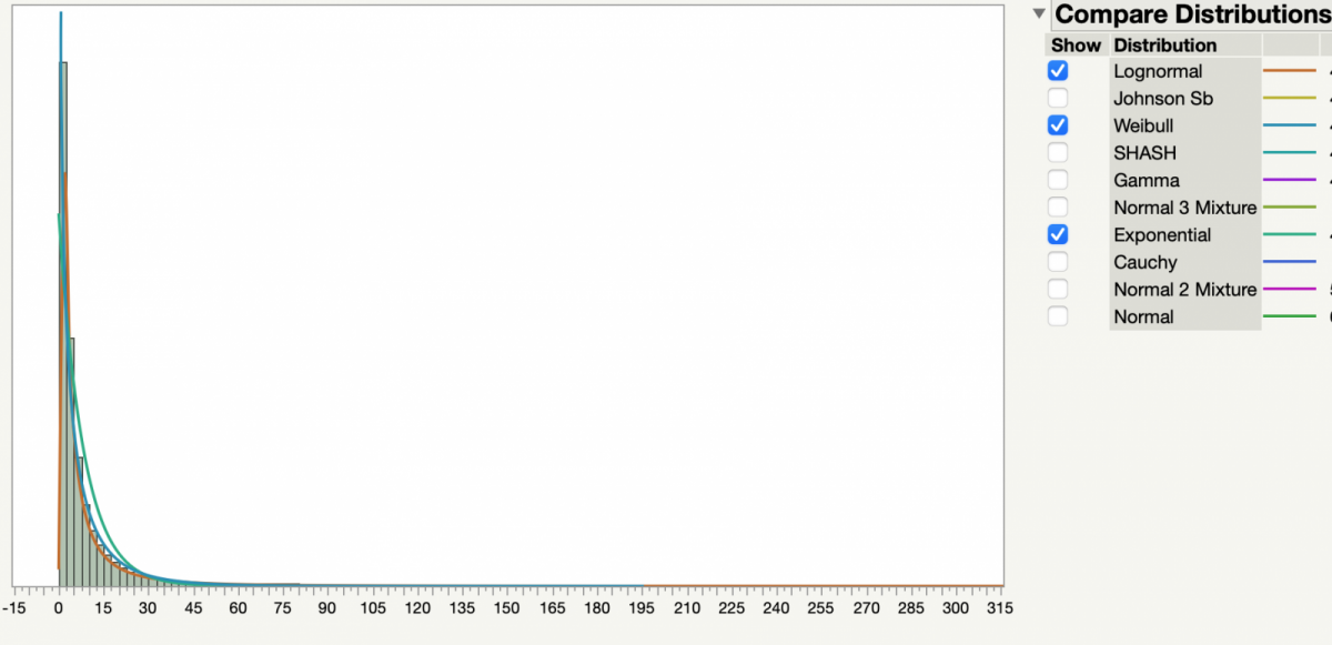
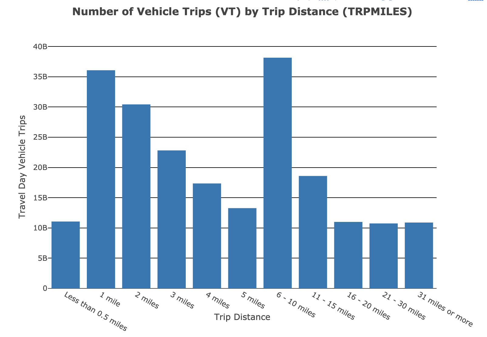
Modeling Driving Distances (3)
Since my last post on using NTHS dataset to fit people’s driving distances, I have made some further modifications: (1) There are some very large TRPMILE data values, in the order of 1000 miles. While there are most likely valid data – After all, people do travel that far – I realize that this is…
-
Modeling Driving Distances (2)
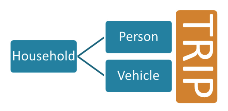
The National Household Travel Survey (NHTS) is probably the most comprehensive data source on driving behaviors of people in the US. It captures travel by US residents in all 50 States and the District of Columbia that includes trips made by “all modes of travel (private vehicle, public transportation, pedestrian and cycling) and for all…
-
Modeling Driving Distances (1)
In order to qualitatively study range anxiety, one of the first steps is to understand people’s driving behavior. A basic question is: What is the statistical distribution of trip lengths of a typical consumer? I found the answer on National Household Travel Survey’s website: https://nhts.ornl.gov/. The variable I am interested in is called “Vehicle trips”,…
-
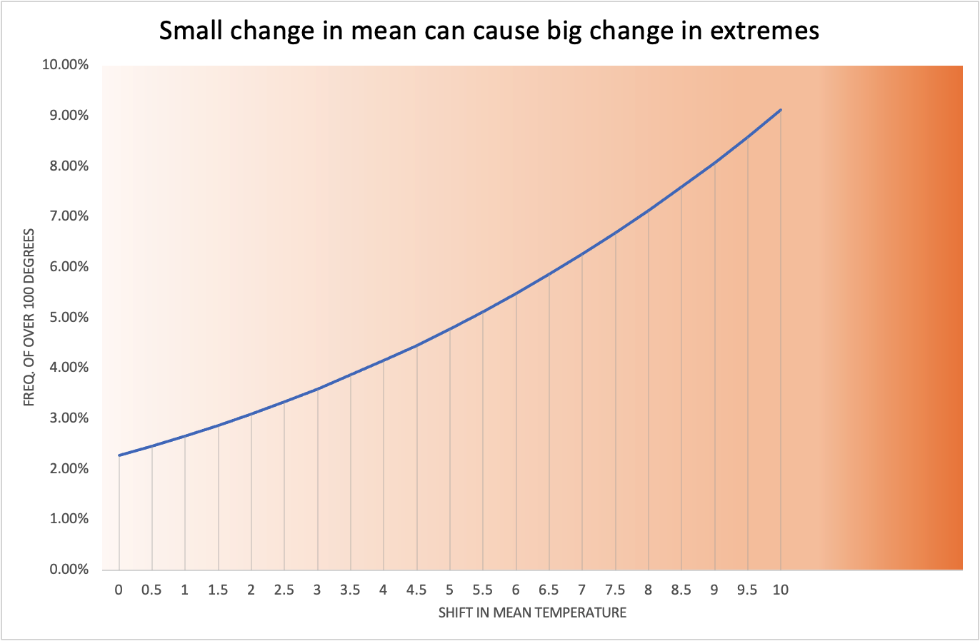
Small change in mean can result in big change in extremes
We have witnessed the recent extreme heat in the US Pacific Northwest. The city of Seattle (one of my favorite cities!) set a new record for the highest temperature ever recorded: 108 degrees. Incidentally the previous record high of 105 degrees was only 11 years ago in 2009. Why do we see extreme weathers more often? I think…
-
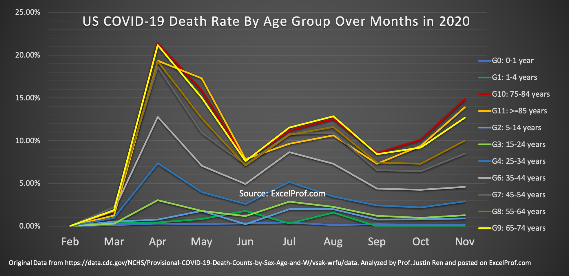
Why Hasn’t Anybody Done This Graph about COVID-19?
The COVID-19 pandemic has been going on for over 9 months now (I am writing this in mid-December of 2020). One question that I have always been thinking about: Has the risk of dying from COVID changed over time? In particular, have younger people become more risky of dying from contracting the virus? I have…
-
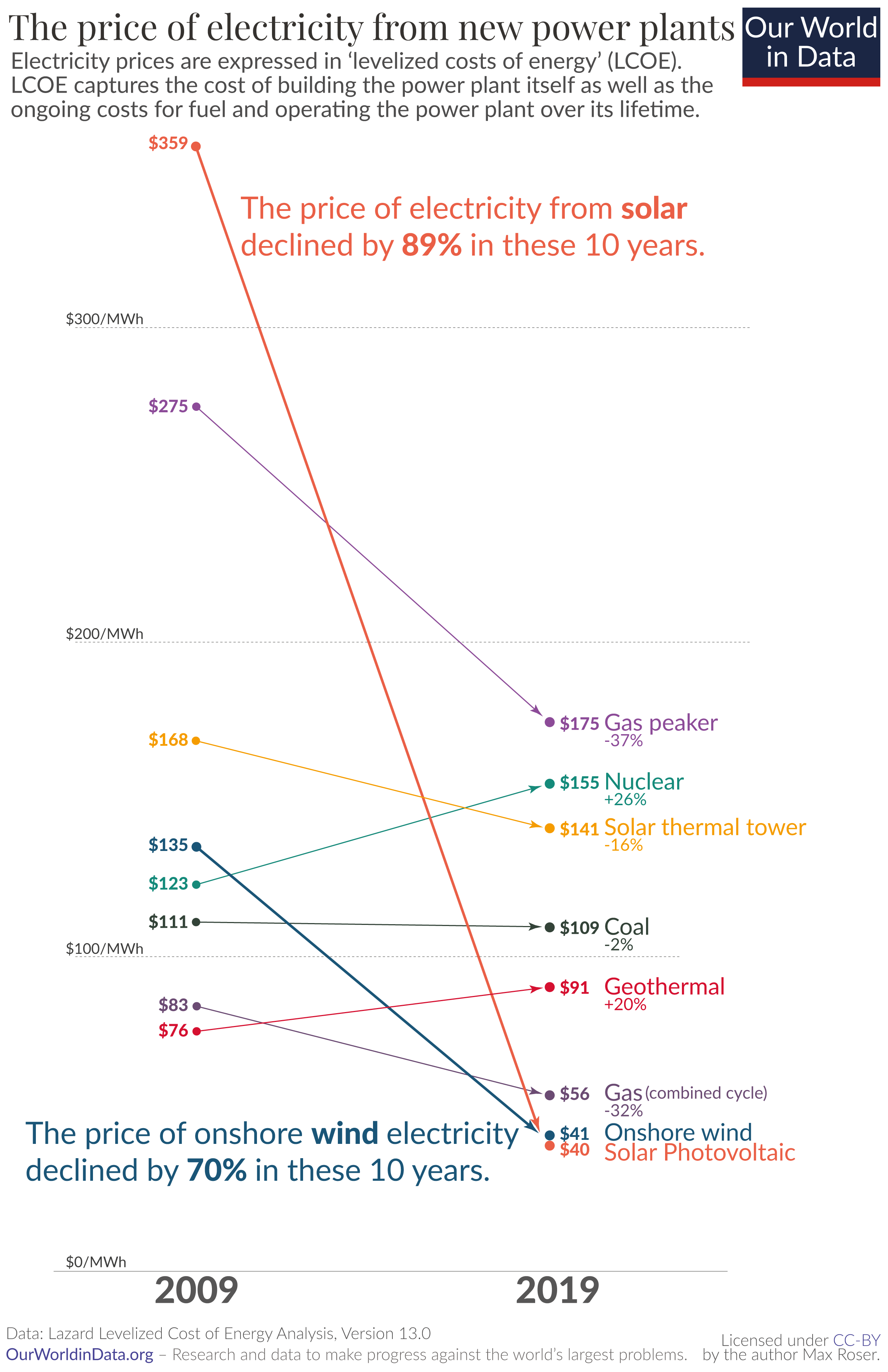
Wow What a Great Data Site
Recently I came across a beautiful data analytics website while I was reading on why renewable energy is showing greater and greater momentum in replacing traditional fossil fuel-based energy. I was mesmerized by the graphs there. Here is an example: Astounding, isn’t it? As the credit on the bottom of the chart shows, the website…
-
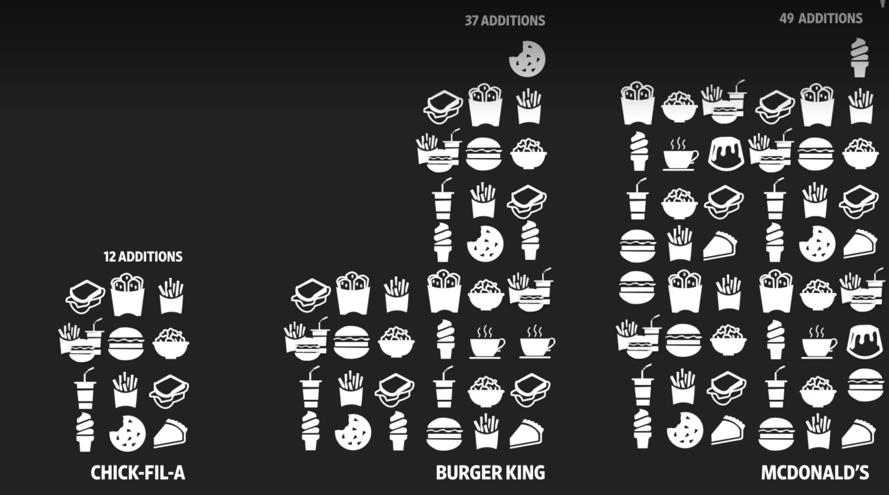
Why is Chick-Fil-A Picking up Market Share (and Why is McDonalds Testing Robot Fryers and Voice-Activated Drive-Through)?
WSJ recently ran an interesting article (and video) on how and why McDonalads is testing using robots to cook and voice-recognition software to take orders at drive-through. The why is simple. To quote the article: “Both technologies are meant to shorten customer wait times that executives acknowledge have grown in recent years. McDonald’s also has…
-
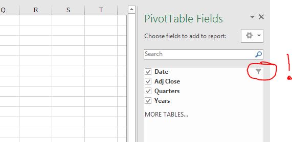
Filter Data Right in your Pivot Table Fields!
One of the ‘hidden treasure’ in Pivot Table a lot of people do not know about is that you can filter data right in your Pivot Table Fields. This is extremely useful if you already know before you do your Pivot Table analysis that you would like to select and use only a subset of…
-
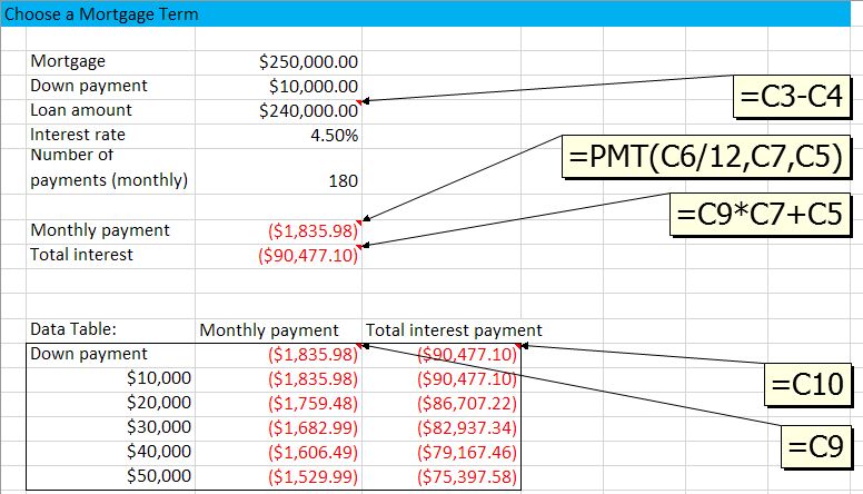
Sensitivity Study (or Scenarios) with Data Table
In managerial decision making, many time we need more than just an optimal decision. Often we would like to know how my results change if I change my decision in a certain way, or if one of the environmental parameters change. In other words, we want to do what-if analysis. In Excel this is made…
-
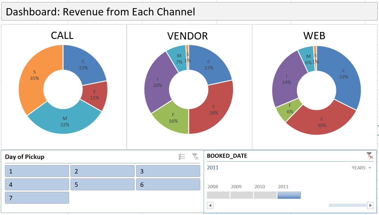
Dashboard with PivotTable
Dashboard is an effective communication tool to summary and highlight your data and your analysis. Here is an example of an Excel Dashboard that I made with PivotTable (and doughnut charts). Download the Excel file here. How do you make an effective dashboard? Here are what I consider some key steps: 1- Have a goal. What…
-
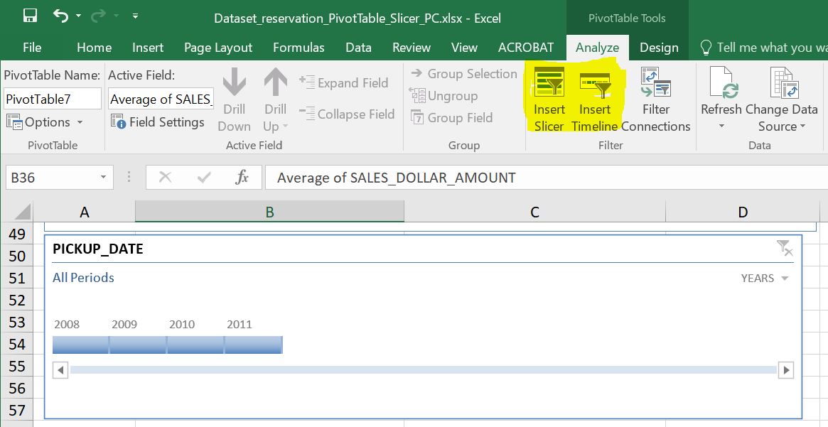
Data Slicer and Timeline are Useful Reporting Tools in PivotTable
Most of us know how to use a Filter in PivotTable, but do you know that there is an even better tool in slicing data in PivotTable? Yes, there is, and the name is, well, Data Slicer. Along with the generic slicer that works for every column, there is another slicer that works specifically for…
-
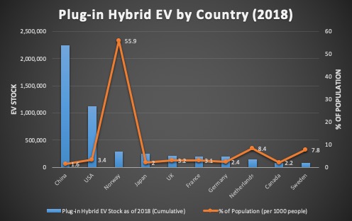
How to Draw a Combo Chart, i.e. Chart with 2 Y-axis, and Change Chart Type on a Mac
When two columns of data are of different scale, you will need to use a combo chart to plot each column on a separate axis. In the video below, one column is numbers of Plug-in Hybrid Electric Vehicle (PHEV) by country, while the other column is percentage values normalized by country population. As you can…