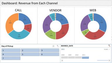
Dashboard with PivotTable
Dashboard is an effective communication tool to summary and highlight your data and your analysis. Here is an example of an Excel Dashboard that I made with PivotTable (and...

Dashboard is an effective communication tool to summary and highlight your data and your analysis. Here is an example of an Excel Dashboard that I made with PivotTable (and...
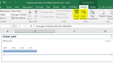
Most of us know how to use a Filter in PivotTable, but do you know that there is an even better tool in slicing data in PivotTable? Yes, there is, and the name is, well, Data...
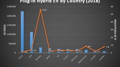
When two columns of data are of different scale, you will need to use a combo chart to plot each column on a separate axis. In the video below, one column is numbers of...
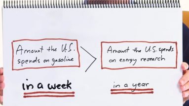
I am a fan of Bill Gates. But the reason I bring his name up in here is because he just demonstrated the power of logical thinking, something very important in Excel modeling....

Finally I found some time to sit down and compile a list of Excel shortcut keys that I personally consider most used (and thus most useful). Please note that these are only...
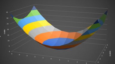
If you have 3-dimensional data, drawing a 3D chart can be very helpful in visualizing how the two variable jointly affect the outcome. In Microsoft Excel, such 3D charts are...
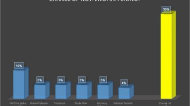
Yesterday, as I was reading a book about Blackstone, the famed asset management company, something caught my attention. It was about how one of its executives describing...
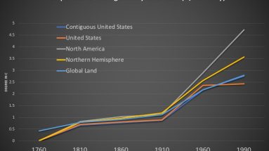
I have always been fascinated by climate data. Just today while researching for data on this topic, I came upon the Berkley Earth website and found that it has warehoused...

Recently I had a conversation with a colleague who argues that Excel will die because he felt people are switching to other computing environments such as R. While I agree...