
Tesla Needs to Be More Rigorous in Discussing Numbers
Not to pick on Tesla – Many companies do this – But it really needs to be more rigorous in discussing its numbers. Take the most recent press release on its car...
Not to pick on Tesla – Many companies do this – But it really needs to be more rigorous in discussing its numbers. Take the most recent press release on its car...
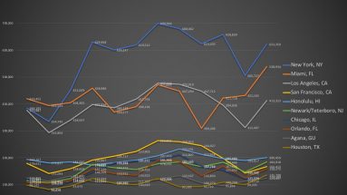
For some business reasons, I need to check what the most popular tourists destinations in the US are. It is not hard to find such data. The US National Travel and Tourism...

Excel is still my number one choice when it comes to graphing and charting, or just first-cut exploring, but I have notice that Google Sheets is also becoming more and more...

My students and I recently began a crowd-sourcing project – To collect some of the most worthy data-centric websites, so that others can learn and share as well. We need...
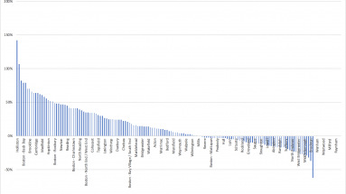
I recently came across an interesting summary table on median condo prices in the Great Boston area (re-created in Excel below; original data from the Boston Magazine, whose...
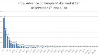
Spring break is upon us. Many students of mine are heading to exotic location, and quite a few of them have reserved rental cars many weeks earlier. But here is the question:...

Many of my students are heavy Uber users. So I asked them one day, “What do you guess should Uber’s monthly ride number be in the US?” It turned out to be a...
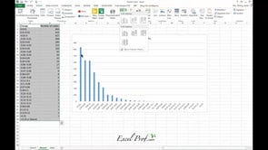
Pareto chart, put simply, is a sorted frequency chart. It is used mainly for identifying the most frequent occurrences in a collected sample. Some business-situation questions...
In many cases, you need to generate a series of graphs using Excel, and yet do not want to put them into one single picture. For example, you would like to draw the price...