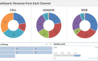
As I showed in a previous post about dash-boarding with Pivot Table, generating multiple charts with a Pivot Table can be very useful. But the problem is that Excel will...
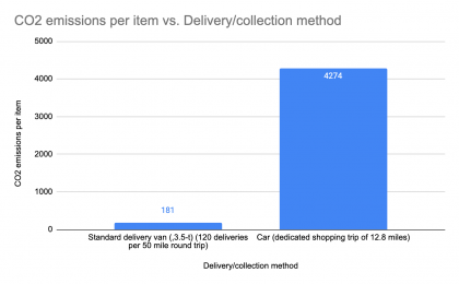
In an early article I discussed the perils of higher carbon print in online grocery shopping (mainly from a paper by Van Loon et al (2015). However, let’s not forget...
Today The International Council on Clean Transportation release a report called “A global comparison of the life-cycle greenhouse gas emissions of combustion engine and...
The National Household Travel Survey (NHTS) is probably the most comprehensive data source on driving behaviors of people in the US. It captures travel by US residents in all...
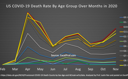
The COVID-19 pandemic has been going on for over 9 months now (I am writing this in mid-December of 2020). One question that I have always been thinking about: Has the risk of...
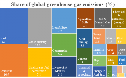
Recently I came across a beautiful data analytics website while I was reading on why renewable energy is showing greater and greater momentum in replacing traditional fossil...
Dashboard is an effective communication tool to summary and highlight your data and your analysis. Here is an example of an Excel Dashboard that I made with PivotTable (and...
Most of us know how to use a Filter in PivotTable, but do you know that there is an even better tool in slicing data in PivotTable? Yes, there is, and the name is, well, Data...
When two columns of data are of different scale, you will need to use a combo chart to plot each column on a separate axis. In the video below, one column is numbers of...