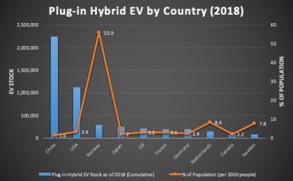
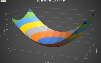
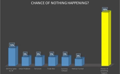
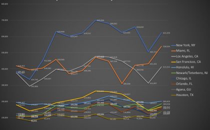
If you have 3-dimensional data, drawing a 3D chart can be very helpful in visualizing how the two variable jointly affect the outcome. In Microsoft Excel, such 3D charts are...
Yesterday, as I was reading a book about Blackstone, the famed asset management company, something caught my attention. It was about how one of its executives describing...
I have always been fascinated by climate data. Just today while researching for data on this topic, I came upon the Berkley Earth website and found that it has warehoused...
For some business reasons, I need to check what the most popular tourists destinations in the US are. It is not hard to find such data. The US National Travel and Tourism...
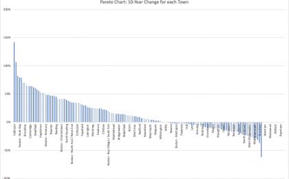
I recently came across an interesting summary table on median condo prices in the Great Boston area (re-created in Excel below; original data from the Boston Magazine, whose...
Spring break is upon us. Many students of mine are heading to exotic location, and quite a few of them have reserved rental cars many weeks earlier. But here is the question:...
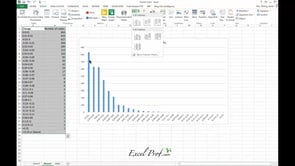
Pareto chart, put simply, is a sorted frequency chart. It is used mainly for identifying the most frequent occurrences in a collected sample. Some business-situation questions...
In many cases, you need to generate a series of graphs using Excel, and yet do not want to put them into one single picture. For example, you would like to draw the price...