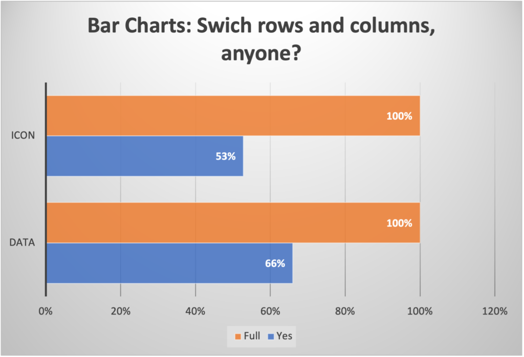
Bar charts are one of the most frequently used charts. To use them effectively to generate on-the-point graphs that deliver exactly the right message, however, requires some deeper understanding as well as a few tricks to make them more appealing.
I made a quick video that talks about:
1- The basic difference between clustered bar charts and stacked bar charts;
2- Why and when to use “Switch rows/columns” feature;
3- When to tweak the overlap and gap width between bars; and
4- How to make your own style of bars.
Here is the video:
You can also download the Excel file here.
